Chapter 6 Assumptions of t-Tests
Supplement to chapter 3 of Ramsey and Schafer’s Statistical Sleuth 3ED for POL90: Statistics.
6.1 Topics and Concepts Covered:
- Log transformations
- Dealing with Outliers
- Bootstrapping Paired Data
6.2 Cloud seeding to increase rainfall
Section 3.1 of Sleuth asks if cloud seeding can actually lead to more rainfall?
# Loading necessary packages
library(Sleuth3)
library(ggplot2)
suppressMessages(library(dplyr))

# Reading data and cleaning names
library(janitor)
##
## Attaching package: 'janitor'## The following objects are masked from 'package:stats':
##
## chisq.test, fisher.testseeding <- Sleuth3::case0301 %>%
clean_names()
head(seeding) ## rainfall treatment
## 1 1202.6 Unseeded
## 2 830.1 Unseeded
## 3 372.4 Unseeded
## 4 345.5 Unseeded
## 5 321.2 Unseeded
## 6 244.3 Unseeded# Viewing summary statistics across different conditions
library(skimr)
seeding %>%
group_by(treatment) %>%
skim()| Name | Piped data |
| Number of rows | 52 |
| Number of columns | 2 |
| _______________________ | |
| Column type frequency: | |
| numeric | 1 |
| ________________________ | |
| Group variables | treatment |
Variable type: numeric
| skim_variable | treatment | n_missing | complete_rate | mean | sd | p0 | p25 | p50 | p75 | p100 | hist |
|---|---|---|---|---|---|---|---|---|---|---|---|
| rainfall | Seeded | 0 | 1 | 441.98 | 650.79 | 4.1 | 98.13 | 221.6 | 406.02 | 2745.6 | ▇▁▁▁▁ |
| rainfall | Unseeded | 0 | 1 | 164.59 | 278.43 | 1.0 | 24.82 | 44.2 | 159.20 | 1202.6 | ▇▂▁▁▁ |
library(DataExplorer)
seeding %>%
  DataExplorer::plot_boxplot(by = "treatment")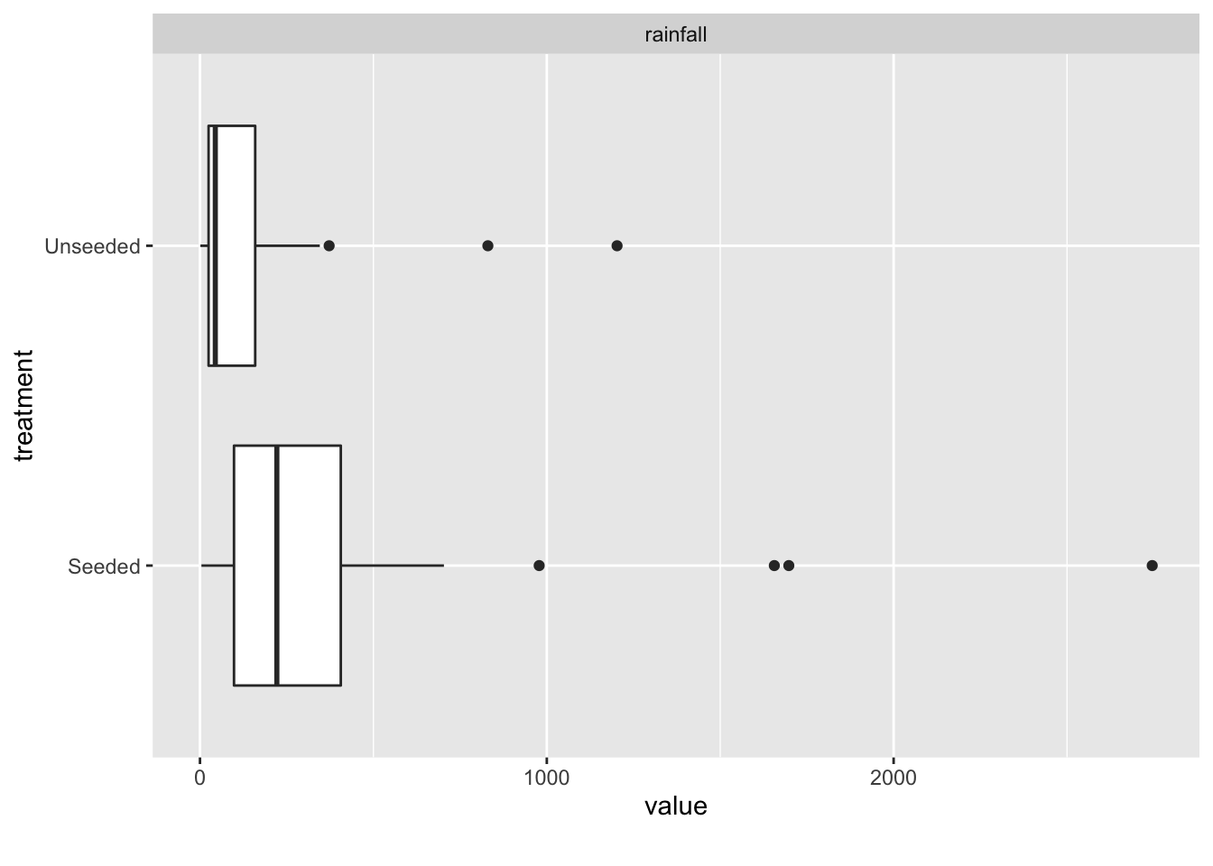
Boxplots and density plots are good first attempts at visualizing the data. This can be done in both base R and ggplot.
boxplot(rainfall ~ treatment,
        data = seeding,
        main = "Boxplot of Rainfall (Base R)")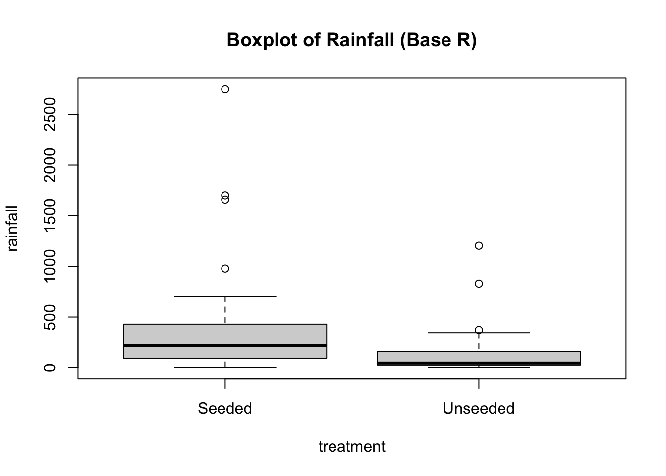
# With ggplot2
ggplot(data = seeding) +
  aes(x = treatment,
      y = rainfall) +
  geom_boxplot() +
  ggtitle("Boxplot of Rainfall (ggplot2)")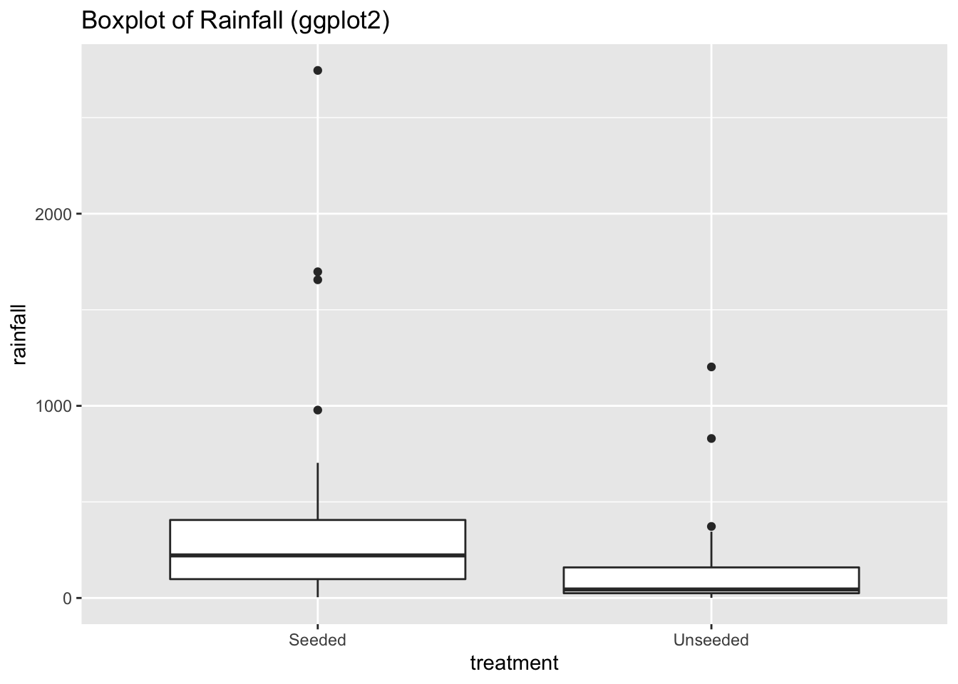
ggplot(data = seeding) +
  aes(x = rainfall,
      color = treatment) +
  geom_density() +
  ggtitle("Density plot of Rainfall under seeded and unseeded conditions")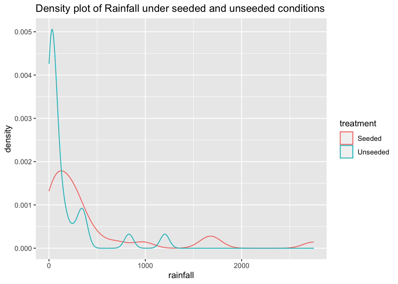
At first glance, it looks like rainfall under seeded conditions is greater than under unseeded conditions. And that rainfall under both conditions is heavily skewed to the right.
In order for \(t\)-tests to be useful, the underlying populations must be approximately normally distributed with similar variances.
{These assumptions may be relaxed in the case of larger samples. See Section 3.2 ``Robustness of Two Sample \(t\)-Tools” in Sleuth}
In this case, the distributions are clearly not normal, and the standard deviations appear to be distinct. This kind of distribution would require a transformation of the data to allow for meaningful application of inferential procedures.
6.3 Log Transformations
A good rule of thumb for knowing when your data might require a log transformation is if the ratio of the largest to smallest measurement in a group is greater than 10.
When analyzing the effect of a treatment on a log-transformed population, we calculate the multiplicative treatment effect.
6.3.1 Multiplicative treatment effect
Let’s say treatment 1 results in a log transformed output of log(\(Y\)). And treatment 2 results in a log transformed output of log(\(Y\)) + \(\delta\).
\[ T_1 \rightarrow log(Y) \\ T_2 \rightarrow log(Y) + \delta \]
Taking the antilog of the results, results in the following:
\[ T_1 \rightarrow e^{log(Y)} = Y\\ T_2 \rightarrow e^{log(Y) + \delta} = Ye^\delta \]
This means that \(e^\delta\) is the multiplicative treatment effect of treatment 2 on the original scale of measurement. i.e. exposing the sample to treatment 2 makes the sample \(e^\delta\) bigger/smaller.
6.3.2 Estimating the multiplicative treatment effect
\(t\)-tools estimate a difference of means. So if we apply \(t\)-tools on a logged transformation, we compute: \(mean(log(Y_1)) - mean(log(Y_2))\). But note, the mean of logged values is not equal to the log of the mean value.
However, because normal distributions are symmetrical:
\[ Mean[Log(Y)] = Median[Log(Y)] \]
And because median preserves ordering:
\[ Median[Log(Y)] = Log[Median(Y)] \]
… where median(\(Y\)) is the 50th percentile of the untransformed sample.
So, for if \(\bar{Z}_1\) and \(\bar{Z}_2\) are means of the logged values in samples 1 and 2, then
\[ \bar{Z}_2 - \bar{Z}_1 = log[Median(Y_2)] - log[Median(Y_1)] \\ \implies \bar{Z}_2 - \bar{Z}_1 = log[\frac{Median(Y_2)}{Median(Y_1)}] \\ \implies exp(\bar{Z}_2 - \bar{Z}_1) = \frac{Median(Y_2)}{Median(Y_1)} \]
That means that it is estimated that the median of sample 2 is \(e^{(\bar{Z}_2 - \bar{Z}_1)}\) times as large as the median of sample 1.
6.3.3 R-Code
# Calculating minimum and maximum values
min <- min(seeding$rainfall)
min
## [1] 1max <- max(seeding$rainfall)
max## [1] 2745.6# Ratio of Max measure to min measure.
max/min ## [1] 2745.6Since the ratio of max measure to min measure is greater than 10, it is a good idea to try a log transformation.
# Create a column of logged rainfall values
seeding <- seeding %>%
  mutate(lograin = log(rainfall))

head(seeding)
## rainfall treatment lograin
## 1 1202.6 Unseeded 7.092241
## 2 830.1 Unseeded 6.721546
## 3 372.4 Unseeded 5.919969
## 4 345.5 Unseeded 5.844993
## 5 321.2 Unseeded 5.772064
## 6 244.3 Unseeded 5.498397# Vewing summary stats of the original and transformed.
summary(seeding$rainfall)## Min. 1st Qu. Median Mean 3rd Qu. Max.
## 1.0 28.9 116.8 303.3 307.4 2745.6summary(seeding$lograin)## Min. 1st Qu. Median Mean 3rd Qu. Max.
## 0.000 3.364 4.760 4.562 5.728 7.918# Using ggplot to view transformation
ggplot(data = seeding) +
aes(x = treatment,
y = lograin) +
geom_boxplot() +
ggtitle("Boxplot of log(Rainfall)")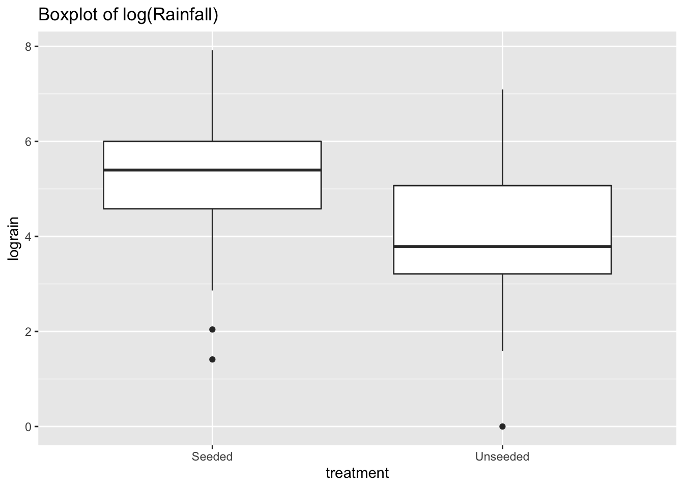
ggplot(data = seeding) +
  aes(x = lograin,
      color = treatment) +
  geom_density() +
  ggtitle("Density plot of log(Rainfall)")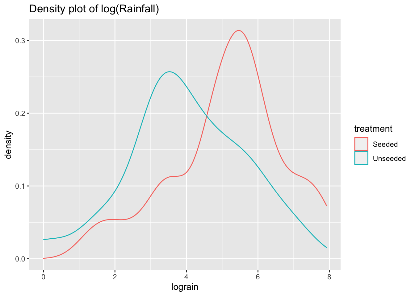
The log transformation reduces the skewness of the two distributions. Now we can perform a two-sample \(t\)-test analysis of the logged transformation.
# Running t-test
#   var.equal=TRUE treats the two variances as being equal
ttest_log = t.test(data = seeding,
                   lograin ~ treatment,
                   var.equal=TRUE)

ttest_log
##
## Two Sample t-test
##
## data: lograin by treatment
## t = 2.5444, df = 50, p-value = 0.01408
## alternative hypothesis: true difference in means between group Seeded and group Unseeded is not equal to 0
## 95 percent confidence interval:
## 0.240865 2.046697
## sample estimates:
## mean in group Seeded mean in group Unseeded
## 5.134187 3.990406And so, the two-sided \(p\)-value is 0.014, and the confidence interval is [0.241, 2.047]. Since, the confidence interval does not straddle zero, and since the \(p\)-value is less than a 5% level of significance, that suggests the two groups’ rainfall measures are significantly different.
To calculate the multiplier effect, we need to use the means of the “Seeded” group and “Unseeded” groups:
# Calculating means of treated and untreated in base R
mean_seed <- mean(seeding$lograin[seeding$treatment == "Seeded"])
mean_seed
## [1] 5.134187mean_unseed <- mean(seeding$lograin[seeding$treatment == "Unseeded"])
mean_unseed## [1] 3.990406# Finding difference in means
meandiff <- mean_seed - mean_unseed
meandiff## [1] 1.143781# Untransforming the difference
multiplier <- exp(meandiff)
multiplier## [1] 3.138614This means that rainfall from seeding is 3.14 times greater than rainfall from not seeding.
The 95% confidence interval for the multiplier is:
# Confidence interval of logged values
ttest_log$conf.int
## [1] 0.240865 2.046697
## attr(,"conf.level")
## [1] 0.95# Conf interval of multiplier:
exp(ttest_log$conf.int)## [1] 1.272349 7.742288
## attr(,"conf.level")
## [1] 0.956.4 Effect of Agent Orange on troops in Vietnam
Is dioxin levels associated with whether the veteran served in Vietnam or not?
# Reading data
orange <- Sleuth2::case0302 %>%
  clean_names()

head(orange)
## dioxin veteran
## 1 0 Vietnam
## 2 0 Vietnam
## 3 0 Vietnam
## 4 0 Vietnam
## 5 0 Vietnam
## 6 1 Vietnamsummary(orange)## dioxin veteran
## Min. : 0.00 Vietnam:646
## 1st Qu.: 3.00 Other : 97
## Median : 4.00
## Mean : 4.25
## 3rd Qu.: 5.00
## Max. :45.00# Viewing summary statistics with base R across different treatments
tapply(orange$dioxin, orange$veteran, summary)## $Vietnam
## Min. 1st Qu. Median Mean 3rd Qu. Max.
## 0.00 3.00 4.00 4.26 5.00 45.00
##
## $Other
## Min. 1st Qu. Median Mean 3rd Qu. Max.
## 0.000 3.000 4.000 4.186 5.000 15.000# Summary statistics using dplyr and skimr
orange %>%
group_by(veteran) %>%
skim()| Name | Piped data |
| Number of rows | 743 |
| Number of columns | 2 |
| _______________________ | |
| Column type frequency: | |
| numeric | 1 |
| ________________________ | |
| Group variables | veteran |
Variable type: numeric
| skim_variable | veteran | n_missing | complete_rate | mean | sd | p0 | p25 | p50 | p75 | p100 | hist |
|---|---|---|---|---|---|---|---|---|---|---|---|
| dioxin | Vietnam | 0 | 1 | 4.26 | 2.64 | 0 | 3 | 4 | 5 | 45 | ▇▁▁▁▁ |
| dioxin | Other | 0 | 1 | 4.19 | 2.30 | 0 | 3 | 4 | 5 | 15 | ▇▇▂▁▁ |
# Summary statistics using dplyr alone
orange %>%
  group_by(veteran) %>%
  summarize(count = n(),
            min = min(dioxin, na.rm = TRUE),
            mean = mean(dioxin, na.rm = TRUE),
            max = max(dioxin, na.rm = TRUE),
            sd = sd(dioxin, na.rm = TRUE)
            )
## # A tibble: 2 × 6
## veteran count min mean max sd
## <fct> <int> <dbl> <dbl> <dbl> <dbl>
## 1 Vietnam 646 0 4.26 45 2.64
## 2 Other 97 0 4.19 15 2.30# Using ggplot to view distribution
ggplot(data = orange) +
aes(x = veteran, y = dioxin) +
geom_boxplot() +
ggtitle("Boxplot of dioxin levels")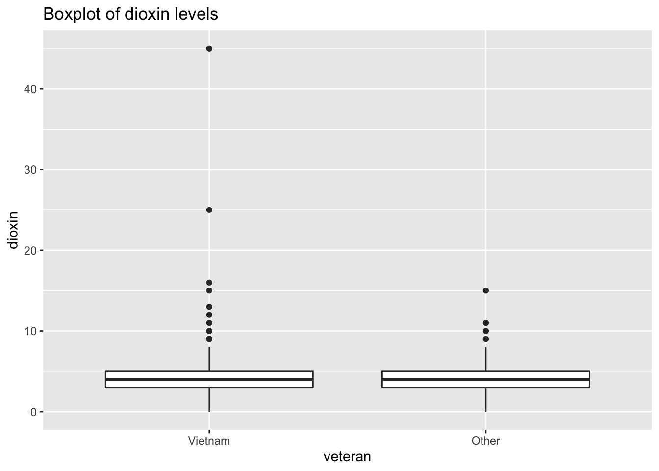
# Using ggplot to view density
ggplot(data = orange) +
    aes(x = dioxin, color = veteran) +
    geom_density() +
    ggtitle("Density plot of dioxin levels")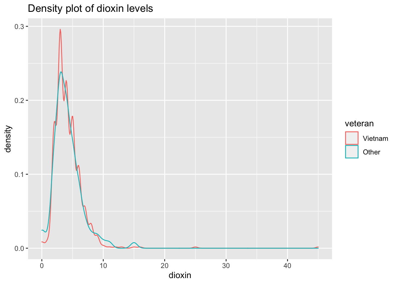
Both distributions are slightly skewed to the right.
Inferential procedures require a two-sample \(t\)-test:
ttest_dioxin <- t.test(data = orange,
                       dioxin ~ veteran,
                       var.equal = TRUE,
                       alternative = "greater") # one-sided test

ttest_dioxin
##
## Two Sample t-test
##
## data: dioxin by veteran
## t = 0.26302, df = 741, p-value = 0.3963
## alternative hypothesis: true difference in means between group Vietnam and group Other is greater than 0
## 95 percent confidence interval:
## -0.391951 Inf
## sample estimates:
## mean in group Vietnam mean in group Other
## 4.260062 4.185567With \(t\)-statistic of 0.263, and a confidence interval straddling zero, the two samples are not significantly different.
6.5 Outliers
The boxplot of dioxin levels shows how the sample of Vietnam vets include two data points that seem like outliers. While there is no systematic way to identify outliers, a visual analysis of the boxplot would argue that the two points (data points 645 and 646) are outliers compared to the rest of the sample of Vietnam vets.
How do we know that the outliers are found in rows 645 and 646?! Good question! Two steps:
- find out the values of the two highest values in the sample (using
arrange()ororder()functions; - use the
which()function to return the row numbers.
# dplyr method
orange_high_dioxin <- orange %>%
  arrange(desc(dioxin)) %>% # arrange in descending order
  slice(1:2)

head(orange_high_dioxin)
## dioxin veteran
## 646 45 Vietnam
## 645 25 Vietnam# A variety of methods using base R
orange_ranked <- orange[order(orange$dioxin, decreasing=TRUE), ]
head(orange_ranked)## dioxin veteran
## 646 45 Vietnam
## 645 25 Vietnam
## 644 16 Vietnam
## 643 15 Vietnam
## 743 15 Other
## 642 13 Vietnam# You can access the first and second values by using "[i, ]"
orange_ranked[1, ] ## dioxin veteran
## 646 45 Vietnamorange_ranked[2, ]## dioxin veteran
## 645 25 Vietnam# The result is the same as hard-coding the value of the max measure
which(orange$dioxin == 45)## [1] 646# Returning the row number of the second highest measurement term
which(orange$dioxin == 25)## [1] 645# OR, ALTERNATIVELY, return rows in orange which match first two rows in orange_ranked
which(orange$dioxin %in% orange_ranked$dioxin[1:2])## [1] 645 646We should remove those data points, and then redo our inferential analyses. We will begin by first removing the most extreme outlier, point 646.
orange_trimmed1 = orange[-c(646), ]

t.test(data = orange_trimmed1,
       dioxin ~ veteran,
       var.equal = TRUE,
       alternative = "less") # one-sided test
##
## Two Sample t-test
##
## data: dioxin by veteran
## t = 0.048902, df = 740, p-value = 0.5195
## alternative hypothesis: true difference in means between group Vietnam and group Other is less than 0
## 95 percent confidence interval:
## -Inf 0.3929744
## sample estimates:
## mean in group Vietnam mean in group Other
## 4.196899 4.185567We perform the same test after removing both outliers, too.
orange_trimmed2 <- orange[-c(646, 654), ]

t.test(data = orange_trimmed2,
       dioxin ~ veteran,
       var.equal = TRUE,
       alternative = "less")
##
## Two Sample t-test
##
## data: dioxin by veteran
## t = -0.049122, df = 739, p-value = 0.4804
## alternative hypothesis: true difference in means between group Vietnam and group Other is less than 0
## 95 percent confidence interval:
## -Inf 0.3719156
## sample estimates:
## mean in group Vietnam mean in group Other
## 4.196899 4.208333Notice that after removing outliers, while \(p\)-values and confidence intervals have changed, the substantive result remains the same. This implies that our finding of non-significance is resistant to excluding outliers.
6.6 Bootstrapping the sampling distribution of the mean with paired data
In this example, we’ll bootstrap or simulate the process of drawing multiple samples from a population to generate a sampling distribution of the mean. In paricular, we’ll use the paired twins affected and unaffected by schizophrenia data from Chapter 2 and simulate the process described in Statistical Sleuth Display 2.3.
6.6.1 Base R bootstrap
First, a base R approach:
# load data and clean data.frame names
twins <- Sleuth3::case0202 %>%
  clean_names()

# Base R approach
twins$diff <-  twins$unaffected - twins$affected

# Look at one example of drawing with replacement
sample(twins$diff, size = 15, replace = TRUE)
## [1] 0.04 0.40 0.59 0.50 0.04 0.11 0.07 0.07 0.50 0.67 0.04 0.10 0.02 0.19 0.10twins_bootstrapped_sim <- NA
twins_bootstrapped_means <- NA
number_of_draws <- 100
for (i in 1:number_of_draws){
twins_bootstrapped_sim <- sample(twins$diff, size = 15, replace = TRUE)
twins_bootstrapped_means[i] <- mean(twins_bootstrapped_sim)
}
# identify cutpoint at 0.025 and 0.975
quantile(twins_bootstrapped_means, c(0.025, 0.975))## 2.5% 97.5%
## 0.08396667 0.30528333hist(twins_bootstrapped_means)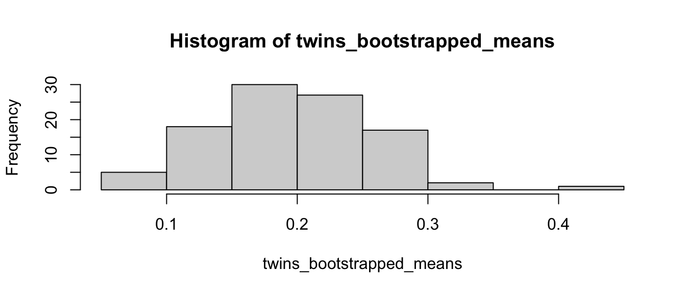
6.6.2 Infer bootstrap
And, a second way with the infer package with the rep_sample_n command. For more, see https://moderndive.com/9-confidence-intervals.html
library(infer)

twins <- Sleuth3::case0202 %>%
  clean_names()

twins <- twins %>%
  # create twin_pair # from row number
  # convert number to categorical
  mutate(twin_pair = row_number() %>% as.factor(),
         twin_diff = unaffected - affected)

head(twins)
## unaffected affected twin_pair twin_diff
## 1 1.94 1.27 1 0.67
## 2 1.44 1.63 2 -0.19
## 3 1.56 1.47 3 0.09
## 4 1.58 1.39 4 0.19
## 5 2.06 1.93 5 0.13
## 6 1.66 1.26 6 0.40# look at one bootstrapped sample
twins %>%
select(twin_pair, twin_diff) %>%
rep_sample_n(size = 15, replace = TRUE, reps = 1) %>%
arrange(twin_pair)## # A tibble: 15 × 3
## # Groups: replicate [1]
## replicate twin_pair twin_diff
## <int> <fct> <dbl>
## 1 1 1 0.67
## 2 1 4 0.190
## 3 1 5 0.130
## 4 1 5 0.130
## 5 1 6 0.4
## 6 1 7 0.0400
## 7 1 8 0.100
## 8 1 9 0.5
## 9 1 9 0.5
## 10 1 10 0.0700
## 11 1 10 0.0700
## 12 1 11 0.23
## 13 1 13 0.0200
## 14 1 13 0.0200
## 15 1 15 0.110# create six bootstrapped samples
six_bootstrap_samples <- twins %>%
rep_sample_n(size = 15, replace = TRUE, reps = 6)
# plot six bootstrapped samples with ggplot facet option
ggplot(six_bootstrap_samples) +
aes(x = twin_diff) +
geom_histogram(bins = 10, color = "white") +
facet_wrap(~ replicate)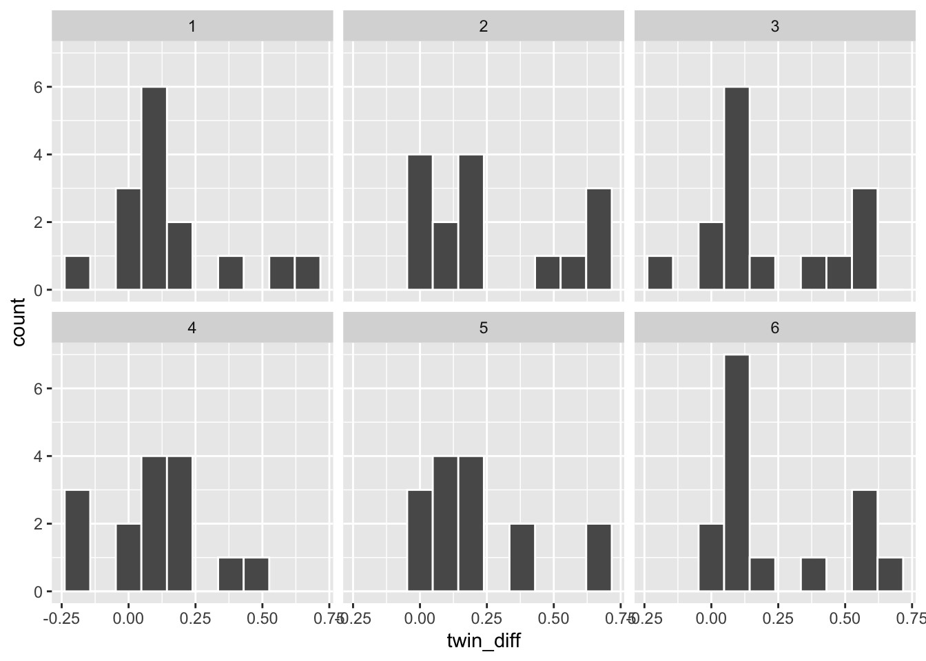
# create 10000 bootstrapped samples
bootstrap_sample <- twins %>%
  select(twin_pair, twin_diff) %>%
  rep_sample_n(size = 15, replace = TRUE, reps = 10000) %>%
  arrange(replicate, twin_pair)

# look at data
dim(bootstrap_sample)
## [1] 150000 3head(bootstrap_sample)## # A tibble: 6 × 3
## # Groups: replicate [1]
## replicate twin_pair twin_diff
## <int> <fct> <dbl>
## 1 1 1 0.67
## 2 1 3 0.0900
## 3 1 5 0.130
## 4 1 6 0.4
## 5 1 7 0.0400
## 6 1 8 0.100# calculate mean by bootstrapped group
bootstrap_means <- bootstrap_sample %>%
group_by(replicate) %>%
summarize(stat = mean(twin_diff))
# look at data
dim(bootstrap_means)## [1] 10000 2head(bootstrap_means)## # A tibble: 6 × 2
## replicate stat
## <int> <dbl>
## 1 1 0.247
## 2 2 0.159
## 3 3 0.263
## 4 4 0.219
## 5 5 0.189
## 6 6 0.215# plot histogram of bootstrapped means
ggplot(data = bootstrap_means) +
aes(x = stat) +
geom_histogram()## `stat_bin()` using `bins = 30`. Pick better value with `binwidth`.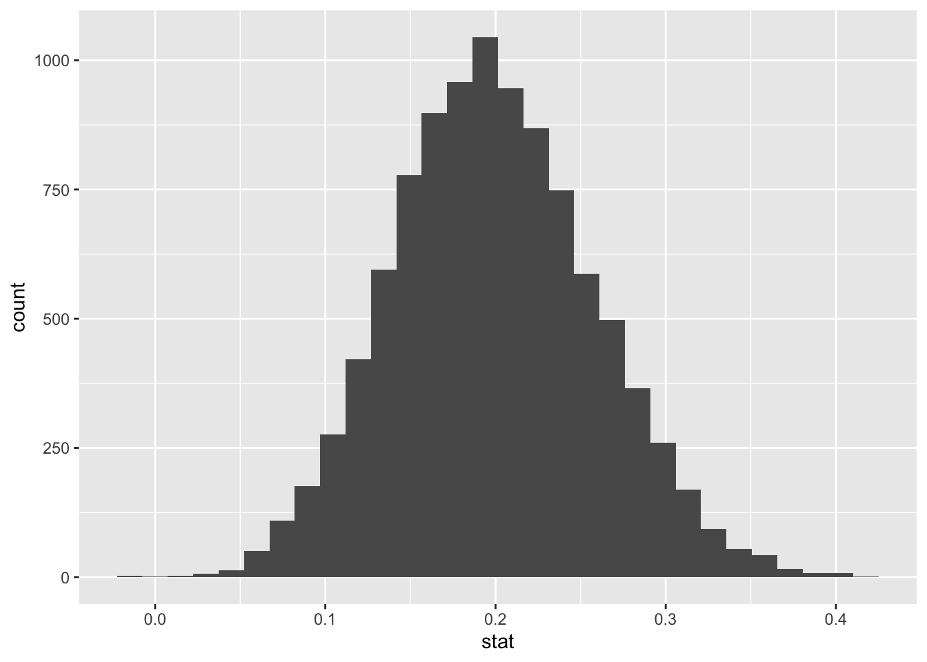
#################################
# calculate bootstrap confidence interval with infer generated data

bootstrap_means %>%
  get_ci(level = 0.95, type = "percentile")
## # A tibble: 1 × 2
## lower_ci upper_ci
## <dbl> <dbl>
## 1 0.0887 0.319bootstrap_means %>%
get_ci(level = 0.9)## # A tibble: 1 × 2
## lower_ci upper_ci
## <dbl> <dbl>
## 1 0.105 0.299percentile_ci <- bootstrap_means %>%
get_ci() %>%
as.numeric() # convert data_frame to vector for use in ggplot
percentile_ci## [1] 0.08866667 0.31866667# plot histogram + ci
ggplot(data = bootstrap_means) +
aes(x = stat) +
geom_histogram() +
geom_vline(xintercept = percentile_ci,
color = "red")## `stat_bin()` using `bins = 30`. Pick better value with `binwidth`.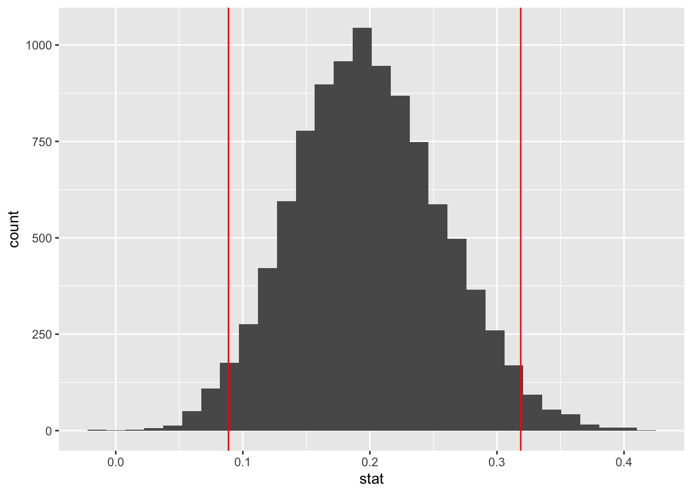
This supplement was put together by Omar Wasow, Sukrit S. Puri, and Blaykyi Kenyah. It builds on prior work by Project Mosaic, an ``NSF-funded initiative to improve the teaching of statistics, calculus, science and computing in the undergraduate curriculum.’’ We are grateful to Nicholas Horton, Linda Loi, Kate Aloisio, and Ruobing Zhang for their effort developing The Statistical Sleuth in R.(horton2013statistical?)