Chapter 5 Inference Using t-Distributions
Supplement to Chapter 2 of Ramsey and Schafer’s Statistical Sleuth 3ed for POL90: Statistics
knitr::opts_chunk$set(echo = TRUE)
options(digits = 3)
5.1 Bumpus’s Data on Natural Selection
Is humerus length related to whether the bird would survive or perish? That’s the question being addressed by Case Study 2.1 in the Statistical Sleuth.
Motivation: We will segment the population of birds into those that survived and those that perished. We can then ask whether these two subsets of the population differ significantly on specific parameters. In this case, we ask whether the two groups differ by humerus length (a type of bone in the wing).
5.1.1 Statistical summary and graphical display
We begin by reading the data and summarizing the variables.
# Loading dataset
bumpus <- Sleuth2::case0201 # always use meaningful name for your data
bumpus[1:2, ] # look first two rows of at data
## Humerus Status
## 1 659 Perished
## 2 689 Perished# Using janitor package to clean the variable names (here, to lower case)
library(janitor)##
## Attaching package: 'janitor'## The following objects are masked from 'package:stats':
##
## chisq.test, fisher.testbumpus <- bumpus %>%
clean_names()
names(bumpus)## [1] "humerus" "status"Before we apply any statistical tests, it’s important to look at the data. Boxplots and density plots provide can visually present how different groups are from one-another.
# base R boxplot
boxplot(
  formula = humerus ~ status,
  data    = bumpus,
  main    = "Boxplot of survived and perished birds")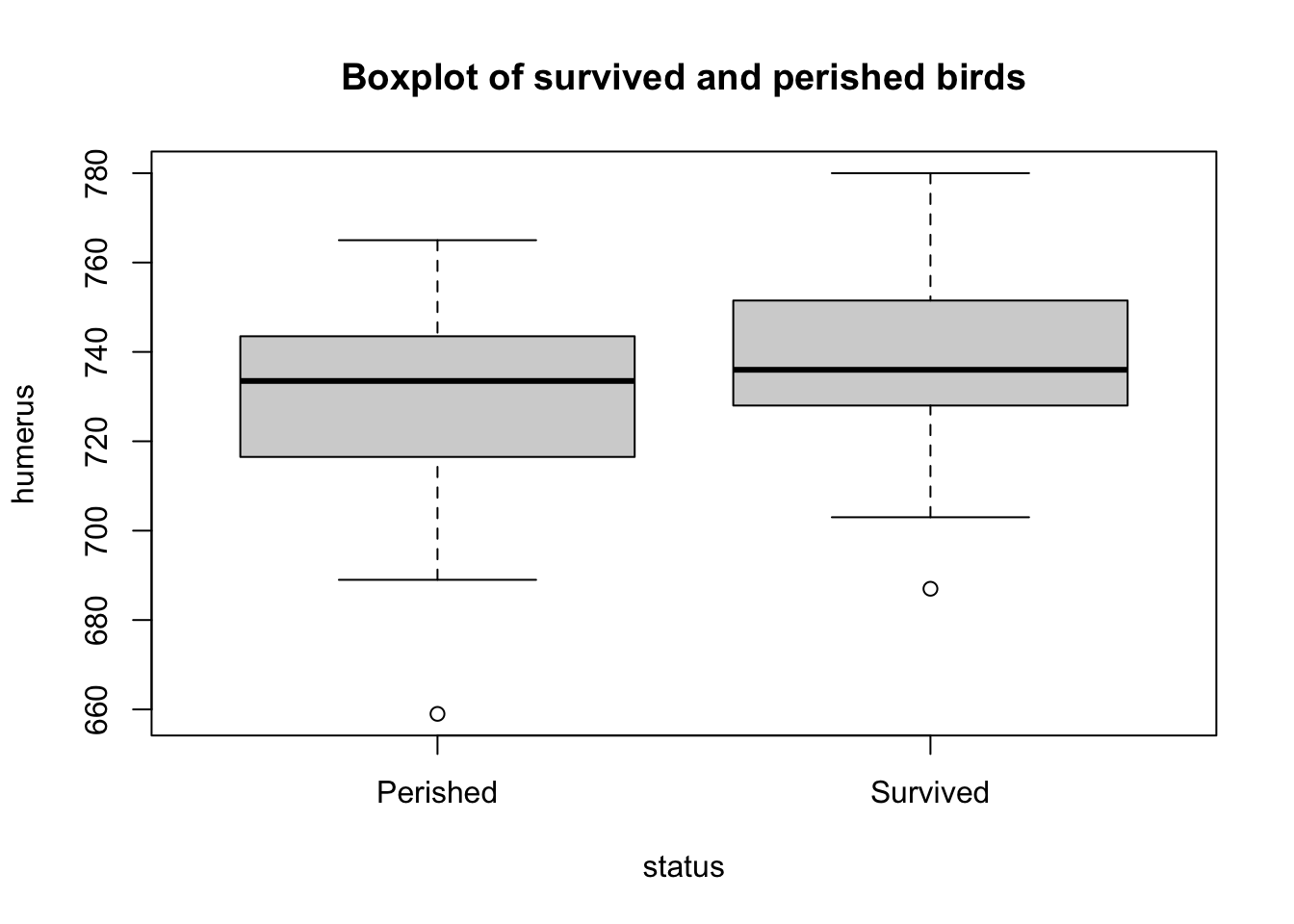
ggplot2 allows users to create more aesthetically pleasing graphs. Coding with ggplot2 can be a bit more involved but is straightforward once you get the basic ideas of aesthetics and layers. The ‘gg’ in the name refer to Leland Wilkinson’s 2005 book The Grammar of Graphics that developed a way of understanding the underlying structure of almost all data visualizations. For more, see ggplot2.
library(ggplot2)

# ggplot2 boxplot
bumpus %>%
  ggplot() +
  aes(x = status,
      y = humerus) +
  geom_boxplot()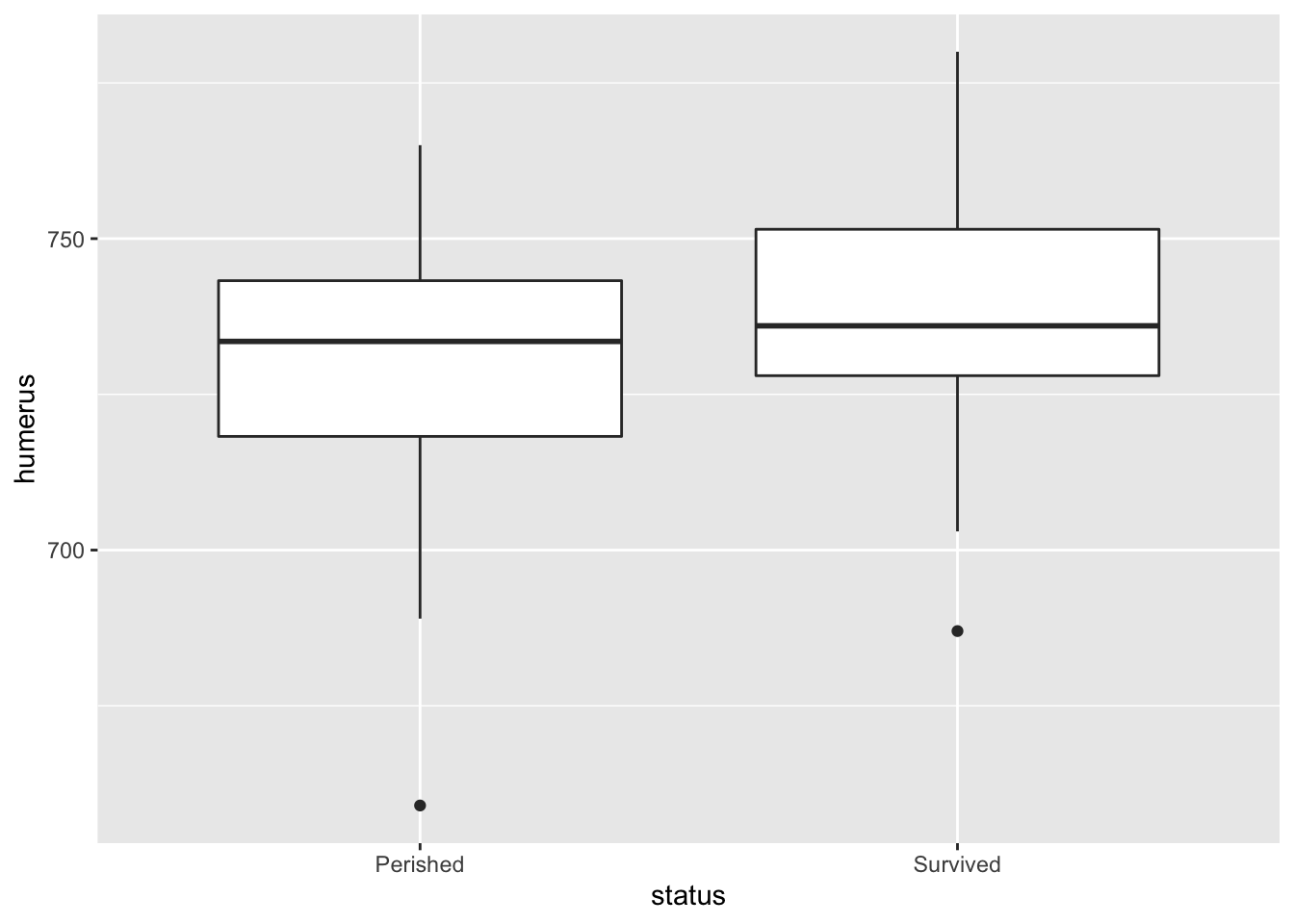
A density plot presents the relative frequency of a particular observation compared to all observations. Thus, its \(y\)-axis is a fraction between 0 and 1.
# Coding density plots in ggplot2
bumpus %>%
  ggplot() +
  aes(x = humerus,
      color = status) +
geom_density() 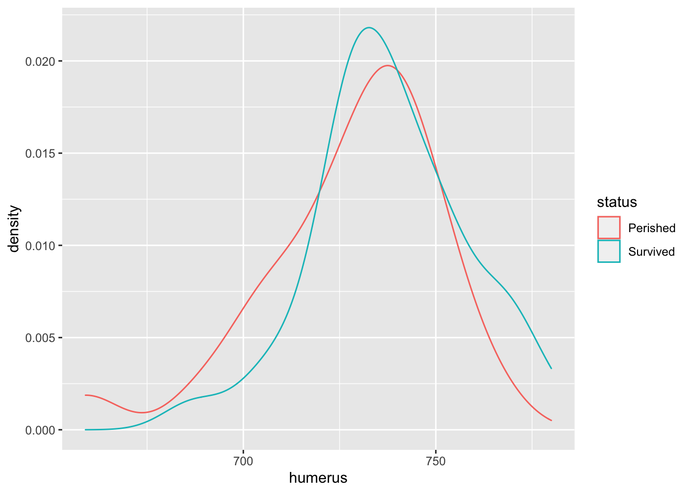
Tip: The summary() command is a good base R option for getting an overview of a vector. The skimr package also has a useful skim function for an overview of a whole data frame. Janitor also has a useful function tabyl() for frequency tables.
# Base R approach
survived <- bumpus[bumpus$status == "Survived", ]
perished <- bumpus[bumpus$status == "Perished", ]

summary(survived$humerus)
## Min. 1st Qu. Median Mean 3rd Qu. Max.
## 687 728 736 738 752 780summary(perished$humerus)## Min. 1st Qu. Median Mean 3rd Qu. Max.
## 659 718 734 728 743 765# Also see skimr::skim function
library(dplyr) # for group_by and pipes##
## Attaching package: 'dplyr'## The following objects are masked from 'package:stats':
##
## filter, lag## The following objects are masked from 'package:base':
##
## intersect, setdiff, setequal, unionlibrary(skimr)
bumpus %>%
group_by(status) %>%
skim_without_charts()| Name | Piped data |
| Number of rows | 59 |
| Number of columns | 2 |
| _______________________ | |
| Column type frequency: | |
| numeric | 1 |
| ________________________ | |
| Group variables | status |
Variable type: numeric
| skim_variable | status | n_missing | complete_rate | mean | sd | p0 | p25 | p50 | p75 | p100 |
|---|---|---|---|---|---|---|---|---|---|---|
| humerus | Perished | 0 | 1 | 728 | 23.5 | 659 | 718 | 734 | 743 | 765 |
| humerus | Survived | 0 | 1 | 738 | 19.8 | 687 | 728 | 736 | 752 | 780 |
5.2 Inferential procedure (two sample \(t\)-test)
Researchers are interested in asking “Is Group X different from Group Y?”. Here, we want to know if birds that survive or perish vary significantly along humerus lengths.
The density plot shows that the mean humerus length of “Survived” is greater than the mean humerus length of “Perished.” We can confirm this by calling the mean() function as well.
ys <- mean(survived$humerus)
ys
## [1] 738yp <- mean(perished$humerus)
yp## [1] 728A way to check if samples are significantly different is to perform a \(t\)-test. Note the \(t\)-ratio formula:
\[ t-ratio = \dfrac{(Estimate) − (Parameter)}{SE(Estimate)} \]
Here, we can think of it in terms of hypotheses.
\[ H_0 : \overline{Y}_s - \overline{Y}_p = 0 \\ H_1 : \overline{Y}_s - \overline{Y}_p \neq 0 \]
So our “Estimate” would be \(\overline{Y}_d = \overline{Y}_s - \overline{Y}_p\)
yd <- ys - yp
yd
## [1] 10.1Our “Parameter” is the Null Hypothesis. Here: \(\overline{Y}_d = 0\).
For our SE(Estimate), we need to calculate a pooled standard deviation of the samples.
NOTE! We can only perform a two-sample pooled \(t\)-test if the standard deviations of the two samples are similar (or assumed to be similar).
We note that the distributions of “Survived” and “Perished” are similar, and we can assume \[\sigma_s = \sigma_p = \sigma \]
The equation for pooled standard deviation (\(\sigma\)) is:
\[ \sigma = \sqrt{\dfrac{(n_s −1)\sigma_s^2 + (n_p −1)\sigma_p^2}{n_s + n_p − 2}} \]
# Count number data points in Survived and Perished groups
ns <- length(survived$humerus)
ns
## [1] 35np <- length(perished$humerus)
np## [1] 24degrees_freedom <- ns + np - 2
# Store standard deviations of each group
ss <- sd(survived$humerus)
ss## [1] 19.8sp <- sd(perished$humerus)
sp## [1] 23.5# Calculate pooled sd
s <- sqrt(((ns - 1) * ss^2 + (np - 1) * sp^2)/(ns + np - 2))
s## [1] 21.4So the SE(Estimate) can be calculated using the following formula:
\[ SE(\overline{Y}_d) = \sigma\sqrt{\dfrac{1}{n_s} + \dfrac{1}{n_p}} \]
se <- s * sqrt((1/ns) + (1/np))
se
## [1] 5.67So now the \(t\)-ratio is:
t <- (yd - 0)/se
t
## [1] 1.78The \(p\)-value associated with this t-ratio is:
# calculate area as or more extreme than t under left tail
# in general, we can't be sure if t is positive or negative
# so, for left tail, we calculate abs() and multiply by -1
pt(q = -1 * abs(t), df = degrees_freedom )
## [1] 0.0405# calculate area as or more extreme than t under right tail
1 - pt(q = abs(t), df = degrees_freedom )## [1] 0.0405# two-tailed test
# left tail x 2
p_two <- pt(q = -abs(t), df = degrees_freedom ) * 2
p_two## [1] 0.0809A \(p\)-value of 0.081 means we would expect to see a difference in means as extreme or more extreme than \(\bar{Y}_d = 10.083\) approximately a 8.09 percent of the time, even if the null hypothesis were true. At a 5% level, this result is not statistically significant. We fail to reject the null hypothesis.
A simpler way to do this process would be to call upon the \(t\)-test function in R.
t.test(formula   = humerus ~ status,
       data      = bumpus,
       var.equal = TRUE)
##
## Two Sample t-test
##
## data: humerus by status
## t = -2, df = 57, p-value = 0.08
## alternative hypothesis: true difference in means between group Perished and group Survived is not equal to 0
## 95 percent confidence interval:
## -21.45 1.28
## sample estimates:
## mean in group Perished mean in group Survived
## 728 738Using infer to run a permutation test:
library(infer)
bumpus_permutations <- bumpus %>%
  specify(humerus ~ status) %>%
  hypothesize(null = "independence") %>%
  generate(reps = 1000, type = "permute") %>%
  calculate(stat = "diff in means", order = c("Survived", "Perished"))

head(bumpus_permutations)
## Response: humerus (numeric)
## Explanatory: status (factor)
## Null Hypothesis: independence
## # A tibble: 6 × 2
## replicate stat
## <int> <dbl>
## 1 1 3.76
## 2 2 -2.63
## 3 3 -5.30
## 4 4 0.952
## 5 5 0.180
## 6 6 8.33bumpus_permutations %>%
ggplot() +
aes(x = stat) +
geom_histogram() +
geom_vline(xintercept = c(-yd, yd),
color = "red")## `stat_bin()` using `bins = 30`. Pick better value with `binwidth`.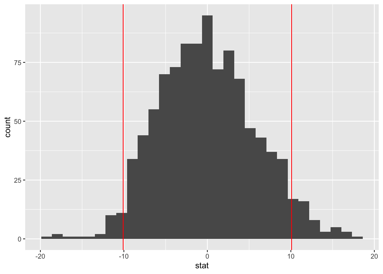
5.3 Anatomical Abnormalities Associated with Schizophrenia
Researchers want to know if there are any physiological indicators of schizophrenia. Early postmortem analysis suggests that certain parts of the brain might be sized differently in individuals who suffer from schizophrenia versus others. Researchers decided to control for exogenous factors that may contribute to variation in hippocampus size by using twins.
# Loading and cleaning dataset
twins <- Sleuth3::case0202  %>%
  janitor::clean_names() # convert column names to lowercase

head(twins)
## unaffected affected
## 1 1.94 1.27
## 2 1.44 1.63
## 3 1.56 1.47
## 4 1.58 1.39
## 5 2.06 1.93
## 6 1.66 1.26There are 15 pairs of twins, within each pair, one is affected by schizophrenia, and the other is not. The difference in area of left hippocampus of these pairs of twins is:
diff <- twins$unaffected - twins$affected
head(diff)
## [1] 0.67 -0.19 0.09 0.19 0.13 0.40twins %>%
skim_without_charts()| Name | Piped data |
| Number of rows | 15 |
| Number of columns | 2 |
| _______________________ | |
| Column type frequency: | |
| numeric | 2 |
| ________________________ | |
| Group variables | None |
Variable type: numeric
| skim_variable | n_missing | complete_rate | mean | sd | p0 | p25 | p50 | p75 | p100 |
|---|---|---|---|---|---|---|---|---|---|
| unaffected | 0 | 1 | 1.76 | 0.24 | 1.25 | 1.60 | 1.77 | 1.94 | 2.08 |
| affected | 0 | 1 | 1.56 | 0.30 | 1.02 | 1.31 | 1.59 | 1.78 | 2.02 |
We can now plot the distribution of these differences:
hist(diff)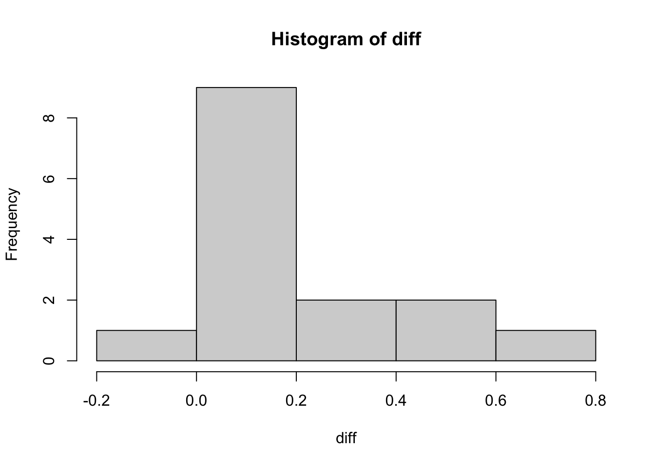
Now we will conduct a paired \(t\)-test, and construct a 95% confidence interval:
Note: Remember the formula for SE here is the following:
\[ \begin{split} SE = \frac{\sigma}{\sqrt{n}} \end{split} \]
diff_mean <- mean(diff)
diff_mean
## [1] 0.199diff_sd <- sd(diff)
diff_sd## [1] 0.238diff_SE <- diff_sd/sqrt(15)
diff_SE## [1] 0.0615t_val <- (diff_mean - 0)/diff_SE
t_val## [1] 3.23# p-value of a two-sided t-test
two_p <- pnorm(-abs(t_val))*2
two_p## [1] 0.00124# construct a 95% confidence interval for a one sample test
q <- qt(p = 0.975, df = 15-1)
q## [1] 2.14lower <- diff_mean - q * diff_SE
lower## [1] 0.0667upper <- diff_mean + q * diff_SE
upper## [1] 0.331And so, our \(p\)-value is: 0.001, which is less than a 5% level of significance, meaning the difference is significant.
And, our 95% confidence interval is (0.067, 0.331).
Tip: If the confidence interval straddles zero, the difference-in-means cannot be statistically distinguished from zero and is not statistically significant.
5.4 Tidy data
Note, that the twins data is structured in a way that important information about each case is not actually stored as data. Data about the condition, that is affected or unaffected, is stored in the column names, not in the cells of the data frame. Similarly, data about pairs of twins is implied by each row but the data is not explicit. For certain kinds of statistical analysis or data visualization, this additional data would need to be stored in the cells.
We can use the tidyr package to reshape the data to a tidy format in which each variable is a column, each observation is a row. For more on tiday data, see Hadley Wickham’s 2014 article, Tidy data.(wickham2014tidy?)
suppressMessages(library(dplyr))
library(tidyr)

# First, create column to indicate units (in this case twin pairs)
tidy_twins <- twins %>%
  mutate(
    # create pair number but treat as a category, not numeric
    # (e.g., twin pair 1 isn't higher ranking than twin pair 2)
    twin_pair = row_number() %>% as.factor()
    )

head(tidy_twins, 3)
## unaffected affected twin_pair
## 1 1.94 1.27 1
## 2 1.44 1.63 2
## 3 1.56 1.47 3# Second, use tidyr package to `pivot_longer` to create `key value` pair
tidy_twins <- tidy_twins %>%
tidyr::pivot_longer(
cols = c('affected', 'unaffected'),
names_to = 'condition',
values_to = 'area'
) %>%
arrange(twin_pair) # sort data
head(tidy_twins)## # A tibble: 6 × 3
## twin_pair condition area
## <fct> <chr> <dbl>
## 1 1 affected 1.27
## 2 1 unaffected 1.94
## 3 2 affected 1.63
## 4 2 unaffected 1.44
## 5 3 affected 1.47
## 6 3 unaffected 1.56tail(tidy_twins)## # A tibble: 6 × 3
## twin_pair condition area
## <fct> <chr> <dbl>
## 1 13 affected 2.02
## 2 13 unaffected 2.04
## 3 14 affected 1.59
## 4 14 unaffected 1.62
## 5 15 affected 1.97
## 6 15 unaffected 2.085.4.1 Diagram of tidy data transformation
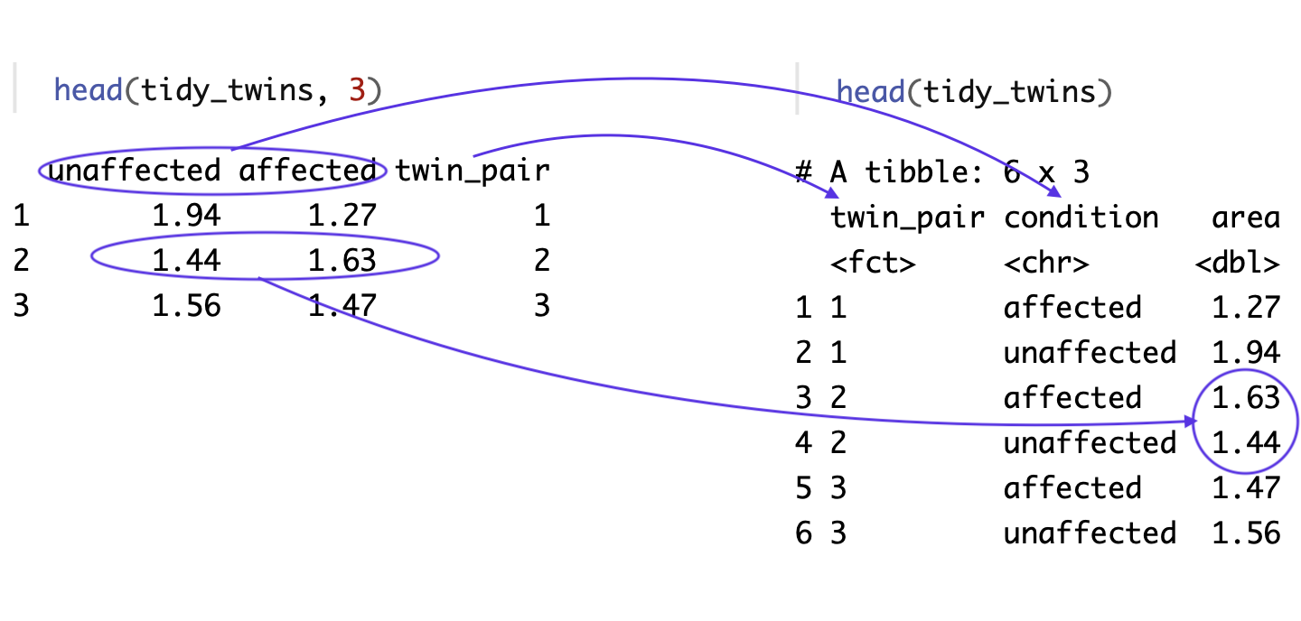
The diagram above shows how pivot_longer() transformed the data.frame.
- In the original data, the twin pair information was not stored as data in the data.frame. So, our first step was creating a column that included each row number, a way to assign a value to each twin pair.
- In the original data, each twin pair is represented by a single row. In the tidy data, each twin is represnted by their own separate row.
- In the original data, the data about the condition of the twin is not stored as data in the data.frame but, rather as descriptive information in the column name. In the tidy data, the twin condition is stored as data in a column called
condition. This column name information is what pivot_longer calls thekey. - In the original data, the hippocampus volume values for both twins is stored in a single row. In the tidy data, each individual twin’s hippocampus area value is in the
areacolumn. This data inside the data.frame whatpivot_longercalls thevalues.
In short, we move from the unit being a twin pair to the unit being an individual twin. And, we move from important values stored in the row numbers and column names, to those data being stored inside the data.frame.
5.4.2 Plotting untidy vs tidy data
A good example of why tidy data has advantages over untidy data is with plotting. If we plot the two available columns in the ‘messy’ data, we can see a relationship in hippocampus valume between the affected and the unaffected twin but it’s hard to evaluate our question of interest which is whether there’s a systematic difference in the volumes within twin pairs.
plot(formula = unaffected ~ affected, data = twins)
abline(lm(formula = unaffected ~ affected, data = twins), col = "red")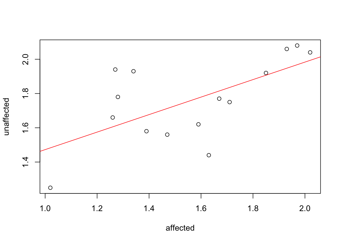
With the tidy data, however, the differences within pairs are much clearer. To plot the relationship between each twin pair, we need to be able to pass ggplot values for an \(x\)-axis, a \(y\)-axis and a group. The plot below would be considerably harder to do with the untidy version of the data. With the tidy data, it is straightforward.
tidy_twins %>%
  ggplot() +
  aes(x = condition, y = area,
      color = twin_pair,
      group = twin_pair) +
    geom_point() +
geom_line() 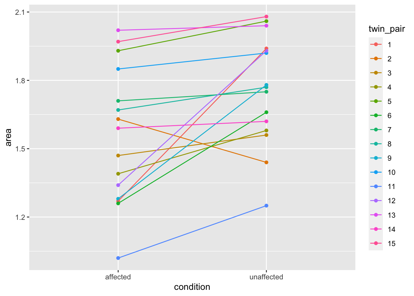
#theme(legend.position="none") # optional hide legend5.4.3 t.test with tidy data
For some older, Base R functions such as a \(t\)-test, using the tidy data is not much different but the code can be more readable. Here we’re testing whether hippocampus area differs by schizophrenia condition.
# traditional syntax
t.test(area ~ condition, data = tidy_twins, var.equal = TRUE)
##
## Two Sample t-test
##
## data: area by condition
## t = -2, df = 28, p-value = 0.06
## alternative hypothesis: true difference in means between group affected and group unaffected is not equal to 0
## 95 percent confidence interval:
## -0.40318 0.00585
## sample estimates:
## mean in group affected mean in group unaffected
## 1.56 1.76# piped syntax
tidy_twins %>%
# t.test command is base R and not updated for pipes (%>%)
# so we use data = . to pass data.frame to `data =` argument in a pipe
t.test(formula = area ~ condition,
data = .,
var.equal = TRUE)##
## Two Sample t-test
##
## data: area by condition
## t = -2, df = 28, p-value = 0.06
## alternative hypothesis: true difference in means between group affected and group unaffected is not equal to 0
## 95 percent confidence interval:
## -0.40318 0.00585
## sample estimates:
## mean in group affected mean in group unaffected
## 1.56 1.765.5 Writing a function
R is a functional programing language which means it has many tools for creating and manipulating functions. Often, it will be helpful to write your own functions to avoid repeating code and making errors. You can think of functions as verbs in that they act on our data objects (which can be thought of as nouns).
# Simple example function
cube <- function(x) {
  x^3
}

cube(5)
## [1] 125# Example function using 'return()'
celsify <- function(fahren_temp) {
# important to put parentheses around whole equation
# otherwise two values are passed by pipe to round()
cel_temp <- ((fahren_temp - 32) * 5/9) %>%
round(1)
return(cel_temp)
}
celsify(32)## [1] 0celsify(100)## [1] 37.8# Example using two input values
raise <- function(x, y) {
x^y
}
raise(3, 2)## [1] 9This supplement was put together by Omar Wasow, Sukrit S. Puri, and Blaykyi Kenyah. It builds on prior work by Project Mosaic, an ``NSF-funded initiative to improve the teaching of statistics, calculus, science and computing in the undergraduate curriculum.’’ We are grateful to Nicholas Horton, Linda Loi, Kate Aloisio, and Ruobing Zhang for their effort developing The Statistical Sleuth in R.(horton2013statistical?)