Chapter 4 Sampling, Randomization Distributions
Supplement to Chapter 1 of Ramsey and Schafer’s Statistical Sleuth 3ed for POL90: Statistics
4.1 Assign Random Numbers
There are many ways to draw random numbers. Here our hypothetical task is to randomly assign a number from 1 to 20 to each of 20 subjects.
# from a vector of 1 to 20, draw 20 times at random draw without replacement
# which means a number cannot be drawn twice
random_numbers <- sample(x = 1:20, size = 20, replace = FALSE)

# view random numbers
random_numbers
## [1] 14 19 16 11 18 8 2 6 17 13 7 1 15 10 12 9 4 20 3 54.2 Order a Data Set
We can use the order function to sort a data set in increasing order. To start, we’ll use the pre-loaded data set called cars with the speed and stopping distance of cars (in the 1920s). We are going to order the distance column.
# view first six rows of cars data
head(cars)
## speed dist
## 1 4 2
## 2 4 10
## 3 7 4
## 4 7 22
## 5 8 16
## 6 9 10# With base R, sort by distance
order_dist <- order(cars$dist) # returns an index of dist from low to high
# returns an index of dist from low to high
head(order_dist)## [1] 1 3 2 6 12 5# create data sorted by distance
sorted_data <- cars[order_dist, ] # sort rows of cars by order_dist
# view sorted data, (also, note how row numbers correspond to order_dist above)
head(sorted_data)## speed dist
## 1 4 2
## 3 7 4
## 2 4 10
## 6 9 10
## 12 12 14
## 5 8 16# load dplyr with suppress warning messages
suppressMessages(library(dplyr)) # with dplyr, sort by distance
cars_by_dist <- cars %>%
arrange(dist)
head(cars_by_dist)## speed dist
## 1 4 2
## 2 7 4
## 3 4 10
## 4 9 10
## 5 12 14
## 6 8 164.3 Create a Large Number of Simulations
# load packages (skip warning messages)
library(janitor, warn.conflicts = FALSE)
library(dplyr,   warn.conflicts = FALSE)
library(ggplot2)
# load data
creativity <- Sleuth3::case0101 %>%
janitor::clean_names() # convert column names to lowercase
# look at data
head(creativity)## score treatment
## 1 5.0 Extrinsic
## 2 5.4 Extrinsic
## 3 6.1 Extrinsic
## 4 10.9 Extrinsic
## 5 11.8 Extrinsic
## 6 12.0 Extrinsic# subset data
intrinsic_subset <- creativity[creativity$treatment == "Intrinsic", ]
extrinsic_subset <- creativity[creativity$treatment == "Extrinsic", ]
# calculate group means
extrinsic_mean <- mean(extrinsic_subset$score)
intrinsic_mean <- mean(intrinsic_subset$score)
# calculate difference in means
diff_observed <- intrinsic_mean - extrinsic_mean
diff_observed## [1] 4.144.3.1 Base R Randomization
# Base R randomization

# Permute data set multiple times
number_of_permutations <- 1000
diff_in_means_sim      <- NULL # create placeholder vector

for (i in 1:number_of_permutations) {

  # copy data
  creativity_shuffled <- creativity

  # shuffle treatment assignment
  creativity_shuffled$treatment <-   sample(creativity_shuffled$treatment)

  # calculate means by condition
  intrinsic_mean <- mean(creativity_shuffled$score[creativity_shuffled$treatment == "Intrinsic"])
  extrinsic_mean <- mean(creativity_shuffled$score[creativity_shuffled$treatment == "Extrinsic"])

  # under null hypothesis, estimate permuted difference
  diff_in_means_sim[i] <- intrinsic_mean - extrinsic_mean
}
# plot a histogram of the randomization distribution
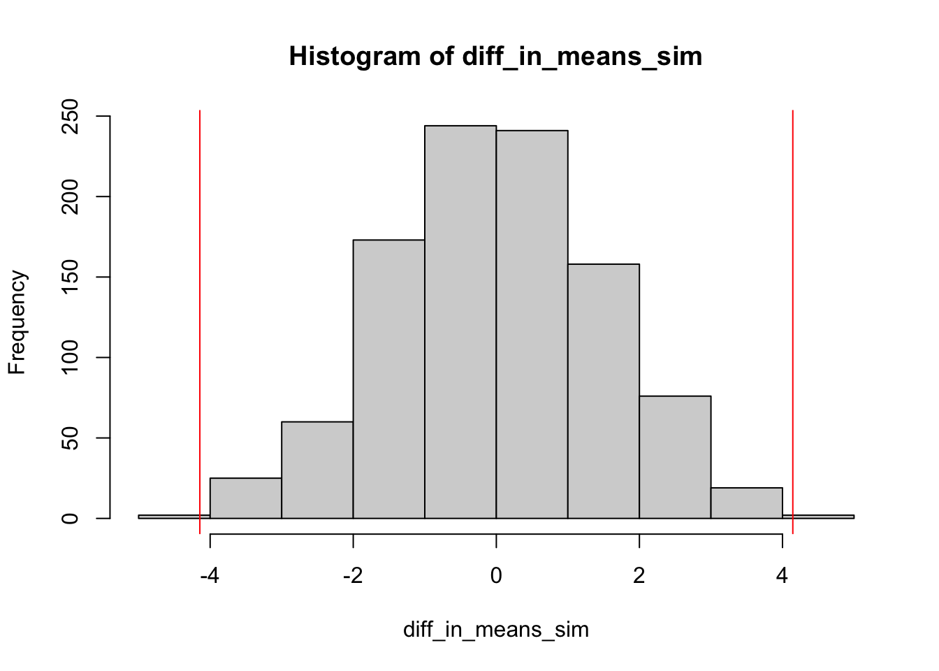
hist(diff_in_means_sim)
# plot vertical lines in left and right tail of observed difference in means (note diff_observed calculated above)
abline(v = diff_observed, col = "red")
abline(v = -diff_observed, col = "red")
4.3.2 Tidy Randomization
# Tidy randomization
# Permute data set multiple times
number_of_permutations <- 1000
diff_in_means_sim      <- NULL # create placeholder vector

for (i in 1:number_of_permutations) {

  # copy and shuffle data
  creativity_shuffled <- creativity %>%
    mutate(treatment_shuffled = sample(treatment))

  # calculate means by condition
  intrinsic_mean <- creativity_shuffled %>%
    filter(treatment_shuffled == "Intrinsic") %>%
    pull(score) %>% # pull single column & convert from data.frame to vector
    mean()

  extrinsic_mean <- creativity_shuffled %>%
    filter(treatment_shuffled == "Extrinsic") %>%
    pull(score) %>% # pull single column & convert from data.frame to vector
    mean()

  # under null hypothesis, estimate permuted difference
  diff_in_means_sim[i] <- intrinsic_mean - extrinsic_mean
}
# plot a histogram of the randomization distribution
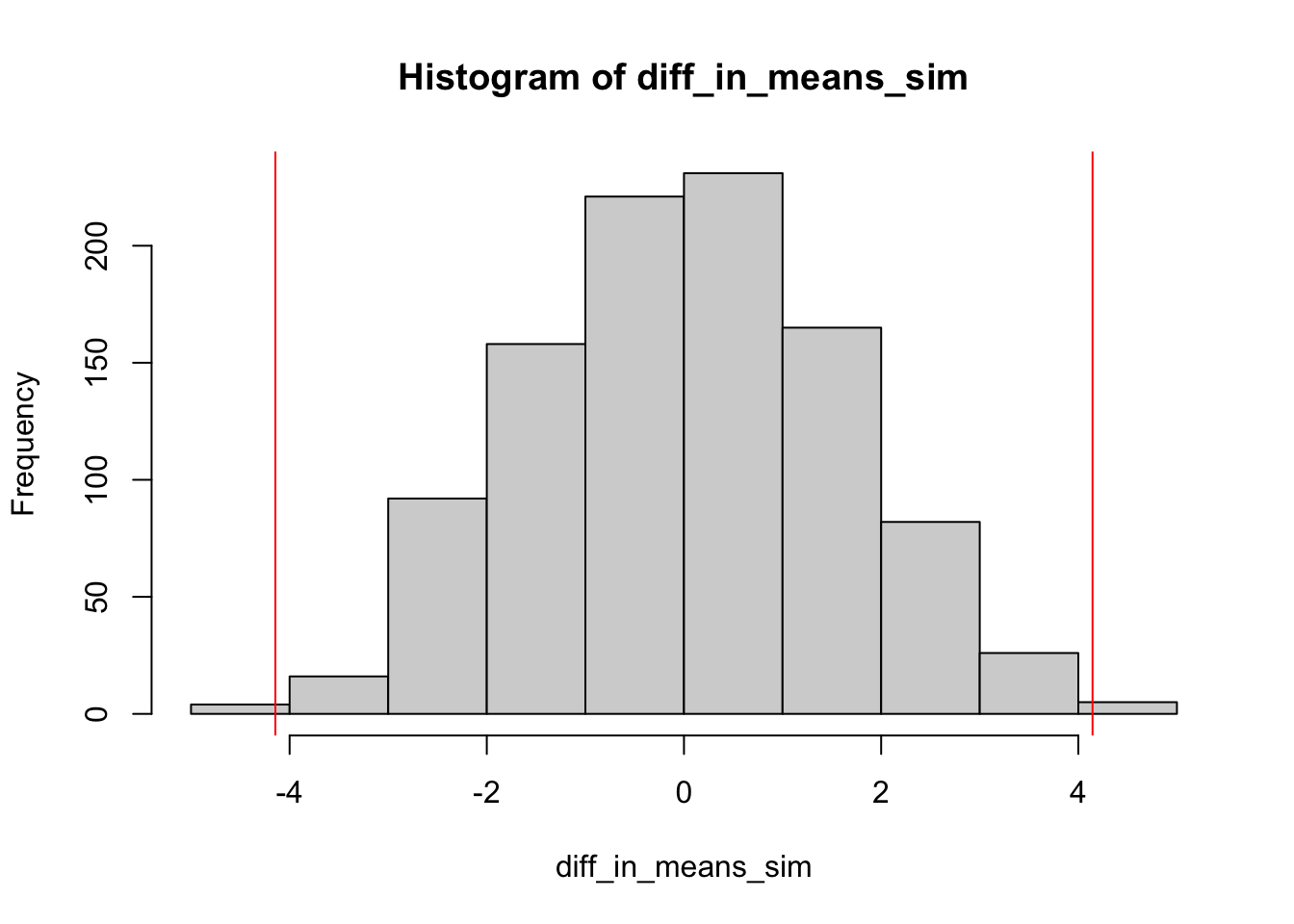
hist(diff_in_means_sim)
# plot vertical lines in left and right tail of observed difference in means (note diff_observed calculated above)
abline(v = diff_observed, col = "red")
abline(v = -diff_observed, col = "red")
Our test statistic is the observed difference in means. If the null hypothesis is true, our test statistic should be ‘’close to zero.’’ If the alternative hypothesis is true, the test statistic should ‘’far from zero.’’ To estimate whether the test statistic is ‘’close to zero’’ or ‘’far from zero,’’ we calculate a \(p\)-value.
From the textbook (p. 13, 3e):
In a randomized experiment the \(p\)-value is the probability that randomization alone leads to a test statistic as extreme as or more extreme than the one observed. The smaller the \(p\)-value, the more unlikely it is that chance assignment is responsible for the discrepancy between groups, and the greater the evidence that the null hypothesis is incorrect.
# calculate number of simulations in which difference in means is as extreme or
# more extreme than the observed test statistic in both tails
# note diff_observed calculated above
right_tail <- sum(diff_in_means_sim >=  abs(diff_observed))
left_tail  <- sum(diff_in_means_sim <= -abs(diff_observed))

# calculate two-sided p-value
pvalue <- (right_tail + left_tail)/number_of_permutations
pvalue
## [1] 0.0084.4 Using the infer package
The above simulation can also be run using a single R package called infer that aims ‘’to perform inference using an expressive statistical grammar.’’ For more about infer, see Modern Dive: An Introduction to Statistical and Data Sciences via R by Chester Ismay and Albert Y. Kim(ismay2018modern?). In short, infer can be used to more intuitively and explicitly walk through the individual steps in many statistical inference methods.
For our purposes, we are going to walk through how to carry out the same analysis we just performed on our dataset to calculate its \(p\)-value under the null hypothsis that \(\mu_{t} - \mu_{c} = 0\)
# Loading required packages
library(infer)


# Pipe new data to infer functions
creativity_shuffled <- creativity %>%

  # Specify the relationship between an outcome and an explanatory variable
  infer::specify(score ~ treatment) %>%

  # Declare a null hypothesis of no relationship between treatment
  # assignment and outcome
  infer::hypothesize(null = "independence") %>%

  # Permute data 1000 times. This randomly reassigns our outcomes to either
  # treatment/control (like previous `for` loop)
  infer::generate(reps = 2000, type = "permute") %>%

  # Calculate the difference-in-means for our permuted dataset
  infer::calculate(stat = "diff in means",
                   order = c("Intrinsic", "Extrinsic"))

# View inferdata
head(creativity_shuffled)
## Response: score (numeric)
## Explanatory: treatment (factor)
## Null Hypothesis: independence
## # A tibble: 6 × 2
## replicate stat
## <int> <dbl>
## 1 1 0.951
## 2 2 1.07
## 3 3 -1.08
## 4 4 1.70
## 5 5 2.33
## 6 6 -0.445# calculate number of extreme simulated values (note diff_observed calculated above)
left_tail <- sum(creativity_shuffled$stat <= -abs(diff_observed))
left_tail## [1] 4right_tail <- sum(creativity_shuffled$stat >= +abs(diff_observed))
right_tail## [1] 8# calculate two-sided p-value
pvalue <- (right_tail + left_tail) / length(creativity_shuffled$stat)
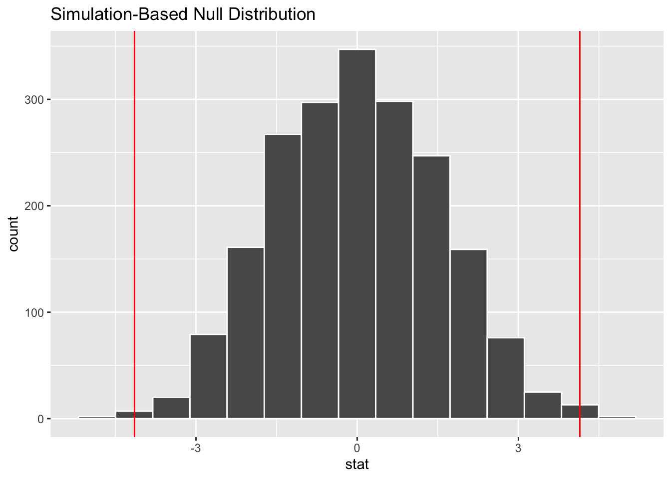
pvalue## [1] 0.006The result is a new data set of 1,000 simulated difference-in-means, one from each permutation. If the null hypothesis is true, our original result will not be extreme compared to these simulated results. That is our observed difference-in-means will be closer to the center of the new distrubtion than the tails. How do we find out whether it is extreme? As before, we can use both calculations and visualizations. Below is a plot to see whether the observed difference appears extreme. We can use infer::visualize for this.
# note diff_observed calculated above
infer::visualize(creativity_shuffled) +
  geom_vline(xintercept = c(-diff_observed, diff_observed),
             col = "red")
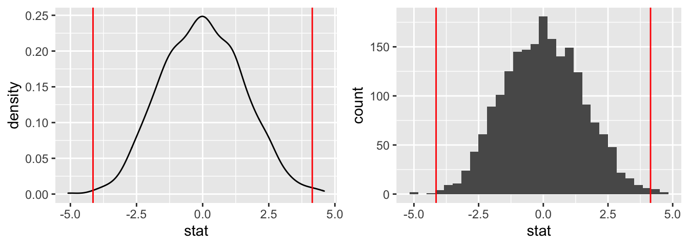
The infer::visualize command uses the powerful visualization package ggplot2. We can also visualize the data directly with ggplot2.
# A density plot (note diff_observed calculated above)
plot_density <- ggplot(data = creativity_shuffled) +
  aes(x = stat) +
  geom_density() +
  geom_vline(xintercept = c(-diff_observed, diff_observed),
             col = "red")

# Or, alternatively, a histogram (note diff_observed calculated above)
plot_hist <- ggplot(data = creativity_shuffled) +
  aes(x = stat) +
  geom_histogram() +
  geom_vline(xintercept = c(-diff_observed, diff_observed),
             col = "red")

# load library to put two plots side-by-side
# set fig.height = 2.5 in chunk header to adjust height of figures

library(gridExtra)
##
## Attaching package: 'gridExtra'## The following object is masked from 'package:dplyr':
##
## combinegrid.arrange(plot_density, plot_hist, ncol = 2)## `stat_bin()` using `bins = 30`. Pick better value with `binwidth`.
The plots confirm our earlier findings that 4.144 is not extreme and, therefore, not statistically significant.
The infer package is quite powerful, and can be used for a lot of other statistical inferences.
4.5 Sample Problem
4.5.0.1 Statistical Sleuth 3e, Chapter 1, Modified Problem 12: Fish Oil and Blood Pressure.
Researchers used 7 red and 7 black playing cards to randomly assign 14 volunteer males with high blood pressure to one of two diets for four weeks: a fish oil diet and a standard oil diet. The reductions in diastolic blood pressure are shown below.
Fish oil diet: 8 12 10 14 2 0 0
Regular oil diet: -6 0 1 2 -3 -4 2
4.5.0.1.1 Questions
- Estimate the difference in mean diastolic blood pressure for the two groups.
- Using a randomization test with 1000 draws, estimate how extreme the observed difference in means is to the randomization distribution under the assumption that there is no effect of the fish oil diet as compared to the regular diet. HINT: You can use the
inferpackage to do this! - Plot the randomization distribution and the observed difference in means.
(Based on a study by H. R. Knapp and G. A. FitzGerald, “The Antihypertensive Effects of Fish Oil,” New England Journal of Medicine 320 (1989): 1037-43.)
This supplement was put together by Omar Wasow, Sukrit S. Puri, and Blaykyi Kenyah. It builds on prior work by Project Mosaic, an ``NSF-funded initiative to improve the teaching of statistics, calculus, science and computing in the undergraduate curriculum.’’ We are grateful to Nicholas Horton, Linda Loi, Kate Aloisio, and Ruobing Zhang for their effort developing The Statistical Sleuth in R.(horton2013statistical?)