The Big Bang
In trying to estimate the age of the universe, researchers are interested in evaluating whether there is a linear relationship between a nebula’s distance from the earth, and the velocity with which it was traveling away from the earth.
We begin by running some setup code, loading packages, reading in and summarizing the data.
knitr::opts_chunk$set(echo = TRUE)
options(digits = 3)
set.seed(1234567) # set randomization to be same every time
# Loading and cleaning names
bang <- Sleuth3::case0701 %>%
  clean_names()

# Viewing dataset and summary
head(bang, 4)
  velocity distance
1      170     0.03
2      290     0.03
3     -130     0.21
4      -70     0.26
# Histograms for distance and velocity, side by side
par(mfrow = c(1,2)) #plots two graphs side by side [1 row. 2 columns]
hist(bang$distance)
hist(bang$velocity)
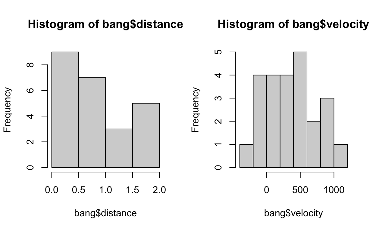
We find that the distributions are quite symmetrical.
We can also visualise the relationship with a scatterplot.
plot(distance ~ velocity,
     data = bang,
     main = "Scatterplot of distance vs velocity")
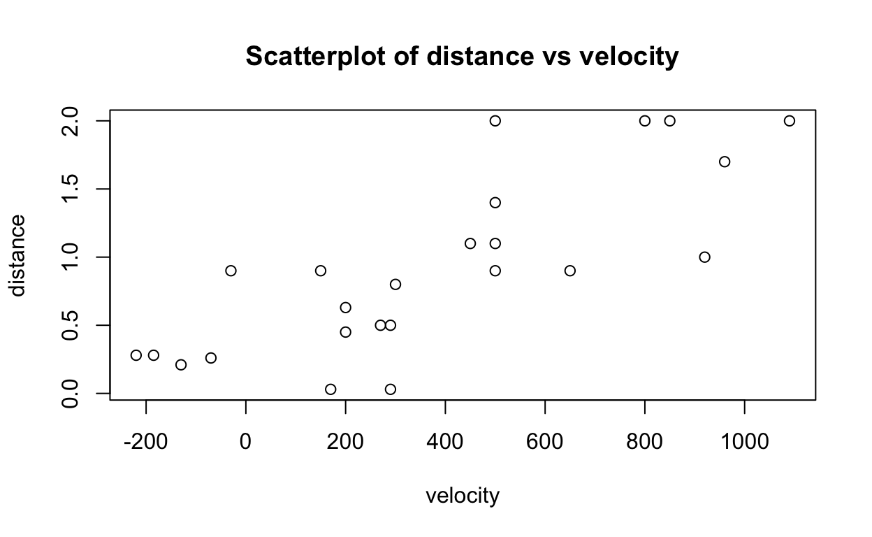
Here’s the same scatterplot with ggplot2.
# Using ggplot to create scatterplot
ggplot(data = bang) +
  aes(x=velocity,
      y=distance) +
  geom_point() +
  ggtitle("Scatter plot of distance vs velocity")
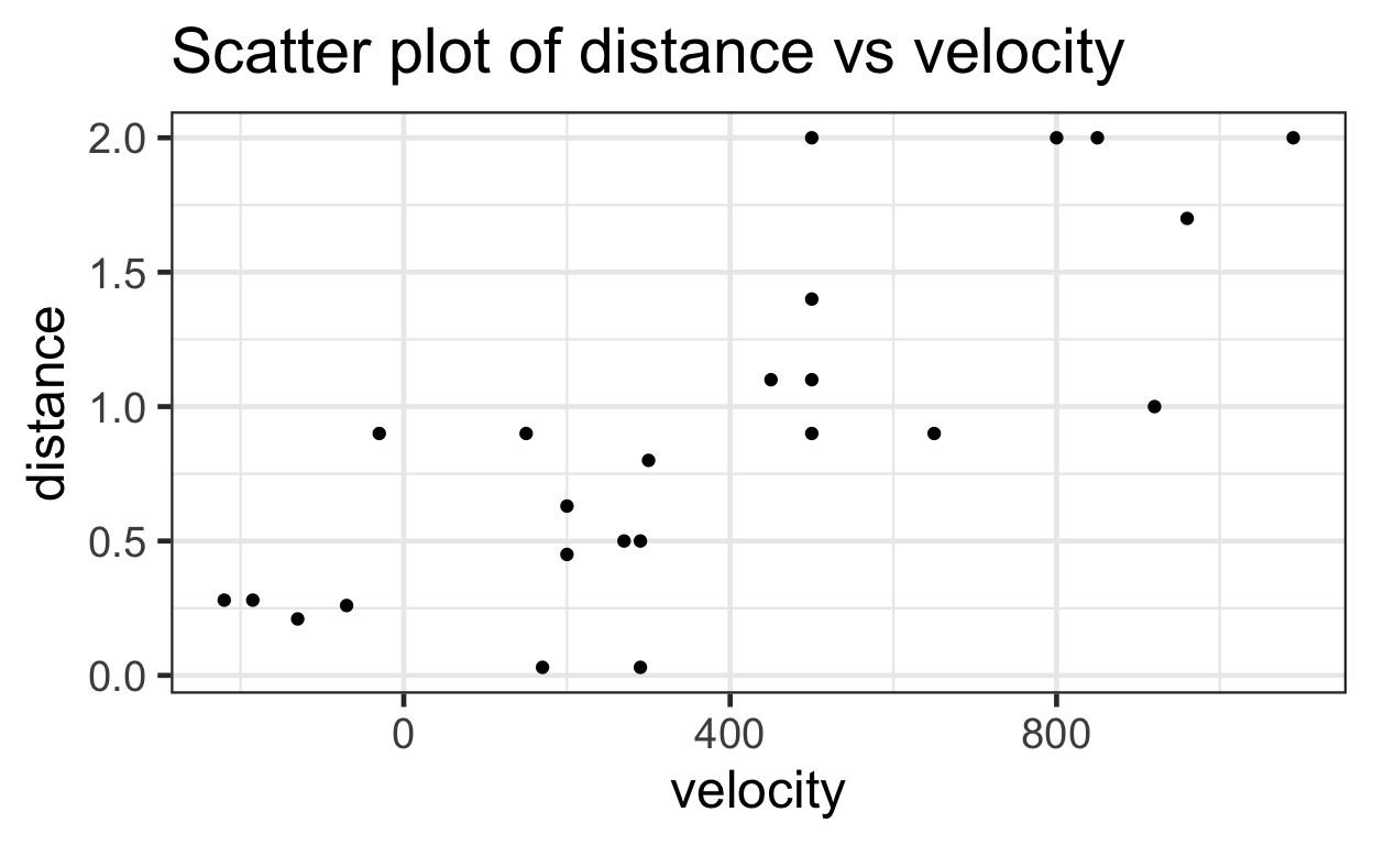
This scatter plot suggests that there is a linear relationship between velocity and distance (i.e. as velocity increases, distance also tends to increase).
We can test this relationship using a linear regression.
Linear Regression
A linear regression estimates the mean of a subpopulation using explanatory variables. The model estimates a straight line relationship that can be modeled using the following formula:
\[ \mu[Y|X] = \beta_0 + \beta_1 X \]
This relationship includes two statistical parameters: \(\beta_0\) which is the intercept of the line. And \(\beta_1\) which is the slope of the line. (Similar to the $y = mx + b $ formula taught in grade school)
Here, the equation is:
\[ \mu[Distance|Velocity] = \beta_0 + \beta_1 Velocity \]
The mean distance measure given a velocity measure can be estimated by $ _0 + _1 Velocity $.
But at any given point X, there is a predicted Y and an actual Y. The difference between the actual and predicted Y is the residual.
All residuals in the model are squared and summed to give the residual sum of squares.
A linear regression is also known as Ordinary Least Squares or OLS because it minimizes the residual sum of squares.
The mathematical solution of \(\beta_0\) and \(\beta_1\) that minimize the residual sum of squares are given here:
\[ \widehat \beta_1 = \frac{\sum_{i = 1}^{n} (X_i - \bar{X})(Y_i - \bar{Y}) } {\sum_{i = 1}^{n} (X_i - \bar{X})^2} \]
and
\[ \widehat \beta_0 = \bar{Y} - \widehat \beta_1 \bar{X} \]
We conduct a linear regression by calling the lm()
function (standing for linear model), whose summary gives us estimates
for \(\beta_0\) and \(\beta_1\).
# Creating and viewing linear regression model
lm1 <- lm(distance ~ velocity, data = bang)
summary(lm1)
Call:
lm(formula = distance ~ velocity, data = bang)

Residuals:
    Min      1Q  Median      3Q     Max
-0.7672 -0.2352 -0.0108  0.2108  0.9146

Coefficients:
            Estimate Std. Error t value Pr(>|t|)
(Intercept) 0.399170   0.118666    3.36   0.0028 **
velocity    0.001372   0.000228    6.02  4.6e-06 ***
---
Signif. codes:  0 '***' 0.001 '**' 0.01 '*' 0.05 '.' 0.1 ' ' 1

Residual standard error: 0.406 on 22 degrees of freedom
Multiple R-squared:  0.623, Adjusted R-squared:  0.605
F-statistic: 36.3 on 1 and 22 DF,  p-value: 4.61e-06
With the stargazer package, we can publish a
professional looking regression table.
# chunk headers must have results='asis' with tables

# Creating table
stargazer(lm1,
          title = "Linear Regression Distance on Velocity",
          type = 'html',
          header = FALSE) # disable stargazer messages in header
| Dependent variable: | |
| distance | |
| velocity | 0.001*** |
| (0.0002) | |
| Constant | 0.399*** |
| (0.119) | |
| Observations | 24 |
| R2 | 0.623 |
| Adjusted R2 | 0.605 |
| Residual Std. Error | 0.406 (df = 22) |
| F Statistic | 36.300*** (df = 1; 22) |
| Note: | p<0.1; p<0.05; p<0.01 |
And so, the estimate for \(\beta_0\) is 0.3991 megaparsecs, and \(\beta_1\) is 0.0014 megaparsecs/(km/sec).
Technical Note: 0.3991 and 0.0014 are estimations of the population parameters \(\beta_0\) and \(\beta_1\) respectively. Because we are only using a sample of the population, we can only estimate the parameters, and so we must attach Standard Errors to the estimates. And so, technically, our estimates are written as \(\widehat \beta_0\) and \(\widehat \beta_1\).
The estimated mean function is
\[ \widehat \mu[Distance|Velocity] = \widehat \beta_0 + \widehat \beta_1 Velocity \]
\(R^2\): “Goodness of fit”
How well does this model fit the data?
Any regression output will provide an R-squared measure that tells us how well a model fits the data. It can be seen as a “goodness of fit”.
In deciding to regression distance on velocity, we have implicitly proposed a model of how to understand distance – through velocity. Furthermore, by using a simple linear regression, we have further included assumptions into our model that the relationship between distance and velocity is linear.
R-Square is a measure of how much better does our model of estimating \(\mu[Y|X]\) hold up versus a naive model of just \(\bar{Y}\) (i.e. the mean of the observations of Y).
Given a set of observations, at any X, there is a real observation \(Y_i\). The mean of all observations is \(\bar{Y}\). And our model produces a predicted \(f_i\).
\[ \bar{Y} = \frac{1}{n} \sum_{i = 1}^{n} Y_i \]
The Total Sum of Squares (TSS) measures the error between the real observations to the naive estimate of \(\bar{Y}\).
\[ SS_{total} = \sum_{i = 1} (Y_i - \bar{Y})^2 \]
The Residual Sum of Squares (RSS) measures the error between the real observations to our model estimate of \(f_i\).
\[ SS_{res} = \sum_{i = 1} (Y_i - f_i)^2 \]
And so, our R-squared is calculated as:
\[ R^2 \equiv 1 - \frac{SS_{res}}{SS_{total}} \]
A model with smaller deviations from the regression lines to the data will reduce \(SS_{res}\) towards zero, making the R-squared approach 1. An R-squared of 1 means the model fits the data perfectly (e.g., all residuals are zero) but, generally, a high R-squared does not necessarily indicate “goodness of fit”. For example, a linear model can often approximate a non-linear relationship fairly well but would not be a good model for the data. See the example below.
# generate a y with a linear relationship to x
n <- 1000
x <- rnorm(n)
y_linear <- x + rnorm(n)

# note the r-squared
lm_example1 <- lm(y_linear ~ x)
summary(lm_example1)
Call:
lm(formula = y_linear ~ x)

Residuals:
   Min     1Q Median     3Q    Max
-3.056 -0.651  0.002  0.639  3.375

Coefficients:
            Estimate Std. Error t value Pr(>|t|)
(Intercept)  -0.0186     0.0314   -0.59     0.55
x             0.9692     0.0316   30.72   <2e-16 ***
---
Signif. codes:  0 '***' 0.001 '**' 0.01 '*' 0.05 '.' 0.1 ' ' 1

Residual standard error: 0.993 on 998 degrees of freedom
Multiple R-squared:  0.486, Adjusted R-squared:  0.485
F-statistic:  944 on 1 and 998 DF,  p-value: <2e-16
# generate a y with a non-linear relationship to x
y_nonlinear <- exp(x) + rnorm(n)
# note the r-squared
lm_example2 <- lm(y_nonlinear ~ x)
summary(lm_example2)
Call:
lm(formula = y_nonlinear ~ x)

Residuals:
   Min     1Q Median     3Q    Max
-3.672 -0.920 -0.141  0.716 11.997

Coefficients:
            Estimate Std. Error t value Pr(>|t|)
(Intercept)   1.6183     0.0473    34.2   <2e-16 ***
x             1.5684     0.0475    33.0   <2e-16 ***
---
Signif. codes:  0 '***' 0.001 '**' 0.01 '*' 0.05 '.' 0.1 ' ' 1

Residual standard error: 1.49 on 998 degrees of freedom
Multiple R-squared:  0.522, Adjusted R-squared:  0.522
F-statistic: 1.09e+03 on 1 and 998 DF, p-value: <2e-16par(mfrow = c(1,2)) #plots two graphs side by side [1 row. 2 columns]
plot(y_linear ~ x)
abline(lm_example1)
rsq1 <- round(summary(lm_example1)$r.squared, 3)
text(-2,3, paste0("R^2=", rsq1))
plot(y_nonlinear ~ x)
abline(lm_example2)
rsq2 <- round(summary(lm_example2)$r.squared, 3)
text(-2,15, paste0("R^2=", rsq2))
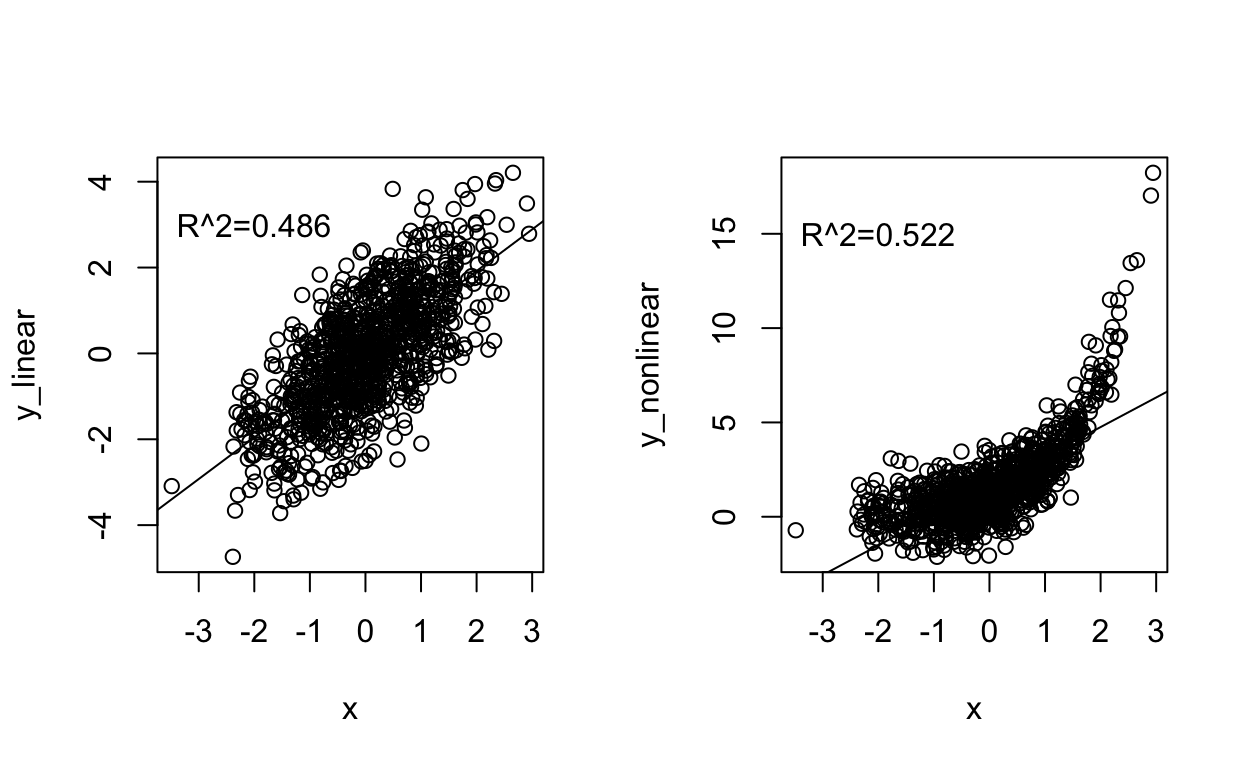
Let’s calculate the R-squared for the regression of distance on velocity data: Remember, the regression output summary gave us an R-squared value of 0.6235.
# Assigning and viewing residuals
residuals <- lm1$residuals
head(residuals, 4)
      1       2       3       4
-0.6025 -0.7672 -0.0108 -0.0431
# Calculating residual sum of squares
ss_res <- sum((residuals)^2)
ss_res
[1] 3.62# Mean of our observations
mean(bang$distance)
[1] 0.911[1] -0.881 -0.881 -0.701 -0.651 -0.631 -0.631# Calculating total sum of squares
ss_tot <- sum((total)^2)
ss_tot
[1] 9.59# Calculating r_squared
r2 <- 1 - (ss_res/ss_tot)
r2
[1] 0.623Remember: An R-squared close to 1 only tells us that the model explains most of the variation in the data but does not mean the model is a good fit for the data. It is possible to get R-squared values close to 1 with a linear model when, in fact, a curvilinear relationship would be more appropriate. More generally, typical R-squared values can vary a lot by field and question such that 0.20 might be high for one analysis and 0.80 low for another type of study.
Visualizing the Regression
Linear regressions in two dimensions can be visualized using a
scatter plot, and the abline() function.
# Plotting distance-velocity plot
plot(distance ~ velocity,
     data = bang,
     main = "Distance vs Velocity")

# Adding abline for lm1
abline(lm1)
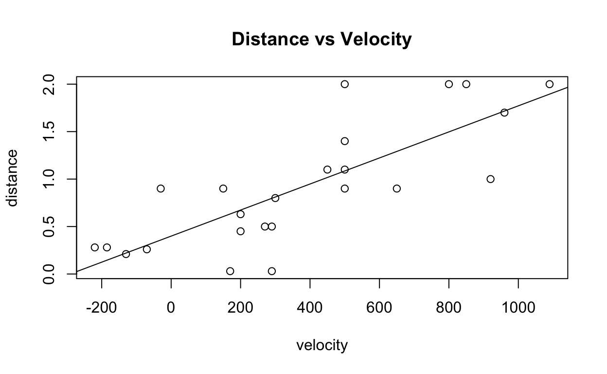
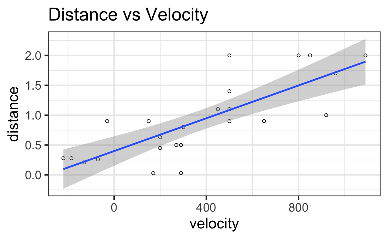
You can see the regression with its confidence intervals here:
ggplot(data = bang) +
  aes(x=velocity,
      y=distance) +
  geom_point(shape = 1) +    # Set to hollow circles.
  geom_smooth(method = lm) +
  ggtitle("Distance vs Velocity")
Linear Regression with No Intercept
On pg 186, researchers propose a model for \(\widehat \mu[Y|X] = \beta_1 X\) with no intercept, where \(\beta_1\) is the age of the universe. Note this model is different than the model we were previously using, which included \(\beta_0\).
And so, while we currently have \(\beta_1\) = 0.0014, that is not the right estimate for this new model. Instead, we must tweak our R-code.
Call:
lm(formula = distance ~ velocity - 1, data = bang)

Residuals:
    Min      1Q  Median      3Q     Max
-0.7677 -0.0691  0.2295  0.4606  1.0393

Coefficients:
         Estimate Std. Error t value Pr(>|t|)
velocity 0.001921   0.000191      10    7e-10 ***
---
Signif. codes:  0 '***' 0.001 '**' 0.01 '*' 0.05 '.' 0.1 ' ' 1

Residual standard error: 0.488 on 23 degrees of freedom
Multiple R-squared:  0.814, Adjusted R-squared:  0.806
F-statistic:  101 on 1 and 23 DF,  p-value: 7.05e-10
# Calculating confidence interval
confint(lm2)
           2.5 %  97.5 %
velocity 0.00153 0.00232
Without the intercept, the new estimate for \(\beta_1\) is 0.0019 megaparsec-second/km. The standard error is 1.91×10⁻⁴ megaparsecs with 23 degrees of freedom. The 95% confidence interval is (0.0015, 0.0023). Because 1 megaparsec-second/km = 979.8 billion years, the confidence interval could be written as 1.5 to 2.27 billion years, and the best estimate is 1.88 billion years (page 186).
Meat Processing and pH
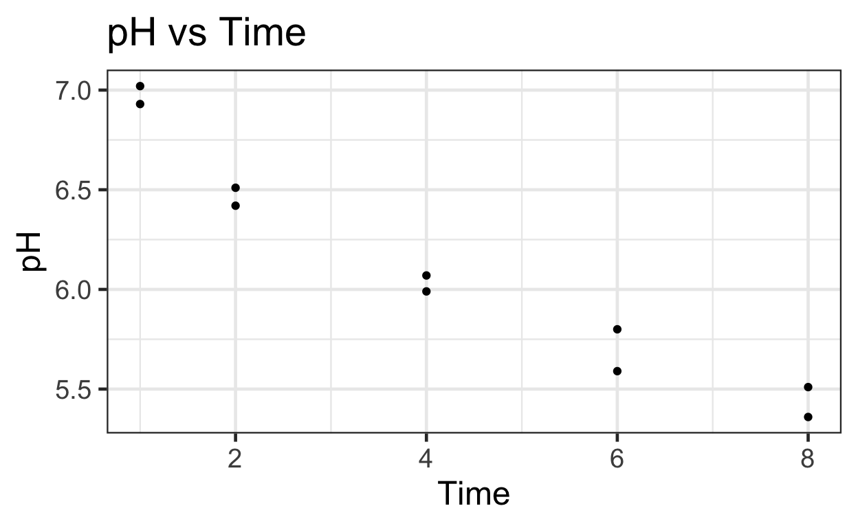
Is there a relationship between postmortem muscle pH and time after slaughter?
We begin by reading in and summarizing the data.
  Time   pH
1    1 7.02
2    1 6.93
3    2 6.42
4    2 6.51
# Plotting untransformed and transformed data
# Untransformed
ggplot(data = meat) +
aes(y = pH,
x = Time) +
geom_point() +
ggtitle("pH vs Time")
#   Transformed
ggplot(data = meat) +
  aes(y = pH,
      x = log(Time)) +
  geom_point() +
  ggtitle("pH vs log(Time)")
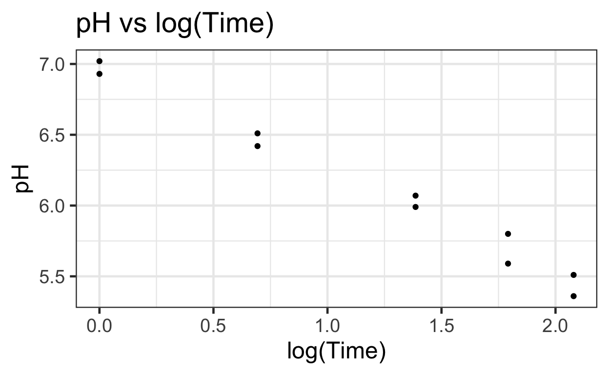
Log(time) vs pH seems to provide a more linear relationship that can be modeled using simple OLS.
There appears to be a negative relationship between pH and log(Time).
We can fit a simple linear regression function onto the data.
The estimated mean function will be
\[\widehat \mu[pH|log(Time)] = \beta_0 + \beta_1 * log(Time)\].
# Linear modeling
meat$log_time <- log(meat$Time)
lm3 <- lm(pH ~ log_time, data = meat)
summary(lm3)
Call:
lm(formula = pH ~ log_time, data = meat)

Residuals:
    Min      1Q  Median      3Q     Max
-0.1147 -0.0589  0.0209  0.0361  0.1166

Coefficients:
            Estimate Std. Error t value Pr(>|t|)
(Intercept)   6.9836     0.0485   143.9  6.1e-15 ***
log_time     -0.7257     0.0344   -21.1  2.7e-08 ***
---
Signif. codes:  0 '***' 0.001 '**' 0.01 '*' 0.05 '.' 0.1 ' ' 1

Residual standard error: 0.0823 on 8 degrees of freedom
Multiple R-squared:  0.982, Adjusted R-squared:  0.98
F-statistic:  444 on 1 and 8 DF,  p-value: 2.7e-08
# Extract terms using broom::tidy()
tidy(lm3)
# A tibble: 2 × 5
  term        estimate std.error statistic  p.value
  <chr>          <dbl>     <dbl>     <dbl>    <dbl>
1 (Intercept)    6.98     0.0485     144.  6.08e-15
2 log_time      -0.726    0.0344     -21.1 2.70e- 8
# Extracting intercept using base R coef()
beta0 <- tidy(lm3)[1, "estimate"]
beta0
# A tibble: 1 × 1
  estimate
     <dbl>
1     6.98
# Extracting coefficient for log of time
beta1 <- tidy(lm3)[2, "estimate"]
beta1
# A tibble: 1 × 1
  estimate
     <dbl>
1   -0.726
# Extracting residual standard error
sigma <- summary(lm3)$sigma
sigma
[1] 0.0823The \(\widehat \beta_0\) is 6.9836 and the \(\widehat \beta_1\) is -0.7257. The \(\widehat\sigma\) is 0.0823 (page 187).
Confidence Interval: Predicted Mean of Y for given X
With the previous information, we can calculate the 95% confidence interval for the estimated mean pH of steers 4 hours after slaughter (Display 7.10, page 187):
muhat <- beta0 + beta1 * log(4)
muhat
  estimate
1     5.98
But this calculation is an estimation, and thus we must calculate the accompanying confidence interval.
For a given \(X_0\), we calculated a Predicted \(Y\). This is the formula for Standard Error of the Predicted \(Y\) for a given \(X_0\):
\[ SE[\hat \mu[Y|X_0]] = \hat \sigma \sqrt{\frac{1}{n} + \frac{(X_0 - \bar{X})^2}{(n-1)s_X^2}} \]
where \(\hat \sigma\) is the variance of random sampling error (which we’ve computed to be 0.0823); \(n\) is the the number of observations; \(\bar{X}\) is the average measure of all \(X\)’s; and \(s_X^2\) is the standard deviation of \(X\)’s.
We then add and subtract a scaled SE that we calculated to give us the confidence interval of \(\hat \mu[Y|X_0]\).
n <- nrow(meat)
mean_log_time <- mean(meat$log_time)
sd_log_time   <- sd(meat$log_time)
var_log_time  <- var(meat$log_time)


se <- sigma * sqrt(1/n + (log(4) - mean_log_time)^2/((n - 1) * var_log_time))
se
[1] 0.0269upper <- muhat + qt(0.975, df = 8) * se
upper
  estimate
1     6.04
lower <- muhat - qt(0.975, df = 8) * se
lower
  estimate
1     5.92
We can use the predict() function to get the same
result.
# Extracting the observation at which time = 4
which(meat$Time == 4)
[1] 5 6# Calculating prection for fifth row. Would be same if we called the 6th row (same x-values)
predict(lm3, interval="confidence")[5, ]
 fit  lwr  upr
5.98 5.92 6.04
And so, the 95% confidence interval for the estimated mean at time = 4hrs is (5.92, 6.04).
Prediction Interval
When predicting a Y given X, our best estimate is the mean, which then comes with a confidence interval. A prediction interval is slightly different.
A prediction interval answers the question: for a given X, between what range can we predict to see a future Y value.
Note a confidence interval tells you the uncertainty about estimating a population mean. The prediction interval informs us about the distribution of the data. Thus, the prediction interval tends to be wider than the confidence interval.
Also note, however, while the two intervals are distinct, they are both centred around our estimate of the mean. Which makes sense, because ex ante, we have no better guess about where our next observation will lie than the mean of past measures.
\[ SE[Pred[Y|X_0]] = \hat \sigma \sqrt{1 + \frac{1}{n} + \frac{(X_0 - \bar{X})^2}{(n-1)s_X^2}} \]
Note, the only difference between Eq. 8 and Eq. 7 (SE for confidence interval) is the “+ 1” term that increases the magnitude of a Prediction Interval.
pred <- beta0 + beta1 * log(4)
pred
  estimate
1 5.98[1] 0.0865predupper <- pred + qt(0.975, df = 8) * predse
predupper
  estimate
1     6.18
predlower <- pred - qt(0.975, df = 8) * predse
predlower
  estimate
1     5.78
Alternatively, we can produce the same result with more direct code:
predict(lm3, interval = "prediction")[5, ]
 fit  lwr  upr
5.98 5.78 6.18
And so, we see the 95% prediction interval is (5.778, 6.177).
Visualizing the Confidence and Prediction Intervals
# Calculating confidence intervals
temp <- predict(lm3, interval = "prediction")

# Viewing first few observations of 'temp'
head(temp)
   fit  lwr  upr
1 6.98 6.76 7.20
2 6.98 6.76 7.20
3 6.48 6.28 6.68
4 6.48 6.28 6.68
5 5.98 5.78 6.18
6 5.98 5.78 6.18 Time pH log_time fit lwr upr
1 1 7.02 0.000 6.98 6.76 7.20
2 1 6.93 0.000 6.98 6.76 7.20
3 2 6.42 0.693 6.48 6.28 6.68
4 2 6.51 0.693 6.48 6.28 6.68
5 4 6.07 1.386 5.98 5.78 6.18
6 4 5.99 1.386 5.98 5.78 6.18# Plotting points
ggplot(data = new_df) +
aes(x = log_time,
y = pH) +
geom_point() + #plots the points
geom_line(aes(y = lwr), color = "red", linetype = "dashed") + #lower Pred
geom_line(aes(y = upr), color = "red", linetype = "dashed") + #upper Pred
geom_smooth(method = lm) + # plots the conf int by default
ggtitle("pH vs log_time: Confidence and Prediction Intervals") #title
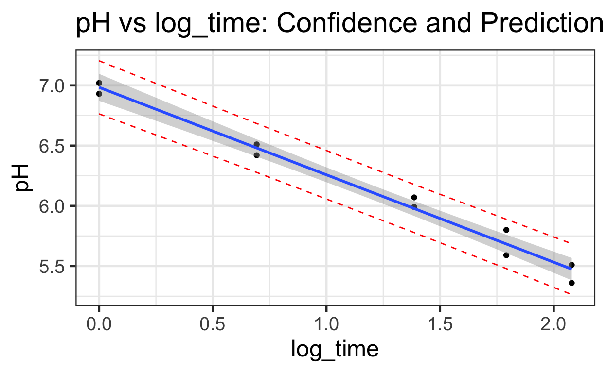
Note the prediction intervals are wider than the confidence intervals.
Intuition for
linear regressions with infer
Null hypothesis via permutation test
As was previously mentioned, the coefficient and intercept values are
estimates of the true parameters, which, unless we have full
information on the population, we can never truly discover. How do we
know then whether they are statistically significant? Refer to the table
produced by stargazer. The asterisks attached to each
estimate gives us information on their statistical significance, as
compared to the null hypothesis that the coefficient is 0, meaning that
there is no relationship between the explanatory and response
variables.
To develop more of an intuition, we can use the infer
package. Below, we will load the datatset for our variables of interest,
and then declare our null hypothesis, that the two variables are
independent of each other. If this is true, then we will observe that
our coefficient is not extreme when compared to those produced from
permutations of the paired samples. This means that we will shuffle the
paired matches so that each \(x\)-value
will be matched to a different \(y\)-value. We will then regress our new
\(y\) on \(x\) and find \(\beta_{1}\). The location of our observed
estimate around the mean (0) will give us a sense of how extreme our
observed result is compared to other possible samples.
First, lets look at 10 rows of the original data, sorted by distance:
# first lets look at 10 rows from the original data
bang %>%
  dplyr::select(distance, velocity) %>%
  arrange(distance) %>%
  head(10)
   distance velocity
1      0.03      170
2      0.03      290
3      0.21     -130
4      0.26      -70
5      0.28     -185
6      0.28     -220
7      0.45      200
8      0.50      290
9      0.50      270
10     0.63      200
Next, with infer we’ll permute the data, sort by
distance and present 10 rows. What do you notice that’s changed between
the original and the permuted data?
# use infer to generate a permutation of the original data
bang %>%
  specify(distance ~ velocity) %>%
  hypothesize(null = "independence") %>%
  generate(reps = 1, type = "permute") %>%
  arrange(distance) %>%
  head(10)
# A tibble: 10 × 3
# Groups:   replicate [1]
   distance velocity replicate
      <dbl>    <dbl>     <int>
 1     0.03      290         1
 2     0.03      500         1
 3     0.21      850         1
 4     0.26      170         1
 5     0.28      290         1
 6     0.28      500         1
 7     0.45      500         1
 8     0.5      -130         1
 9     0.5       200         1
10     0.63      -70         1
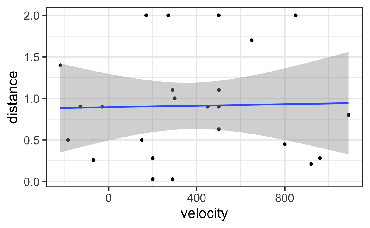
Now let’s plot a permutation of the data. Again, consider what’s
changed about the estimated linear relationship between
distance and velocity as compared to the plots
above.
bang %>%
  specify(distance ~ velocity) %>%
  hypothesize(null = "independence") %>%
  generate(reps = 1, type = "permute") %>%
  ggplot() +
    aes(x = velocity,
        y = distance) +
    geom_point() +
    geom_smooth(method = 'lm')
We can also use infer to take the permuted data and
estimate slopes for the hypothetical sample:
# use infer to permute the data and calculate one slope
bang %>%
  specify(distance ~ velocity) %>%
  hypothesize(null = "independence") %>%
  generate(reps = 1, type = "permute") %>%
  calculate(stat = "slope")
Response: distance (numeric)
Explanatory: velocity (numeric)
Null Hypothesis: independence
# A tibble: 1 × 1
      stat
     <dbl>
1 0.000129
# use infer to permute the data and calculate five slopes
bang %>%
specify(distance ~ velocity) %>%
hypothesize(null = "independence") %>%
generate(reps = 5, type = "permute") %>%
calculate(stat = "slope")
Response: distance (numeric)
Explanatory: velocity (numeric)
Null Hypothesis: independence
# A tibble: 5 × 2
  replicate       stat
      <int>      <dbl>
1         1  0.0000497
2         2 -0.000493
3         3  0.000113
4         4  0.0000777
5         5  0.0000811
Now, if we generate 1,000 permutations of the data, calculate a slope
for each permutation we’ll have a data set of possible slopes under the
null hypothesis that there is no relationship between our \(Y\) and our \(X\) terms, here distance and
velocity.
inferbang <- bang %>%
  specify(distance ~ velocity) %>%
  hypothesize(null = "independence") %>%
  generate(reps = 1000, type = "permute") %>%
  calculate(stat = "slope")

head(inferbang)
Response: distance (numeric)
Explanatory: velocity (numeric)
Null Hypothesis: independence
# A tibble: 6 × 2
  replicate       stat
      <int>      <dbl>
1         1 -0.0000505
2         2  0.000187
3         3  0.000263
4         4 -0.000369
5         5  0.000635
6         6  0.0000796
observed_velocity_coef <- lm1$coefficients[2]
# how many slopes are as extreme or more extreme than our observed slope?
sum(abs(inferbang$stat) >= abs(observed_velocity_coef))
[1] 0# plot with infer::visualize
inferbang %>%
visualize() +
geom_vline(xintercept = observed_velocity_coef, col = "red")
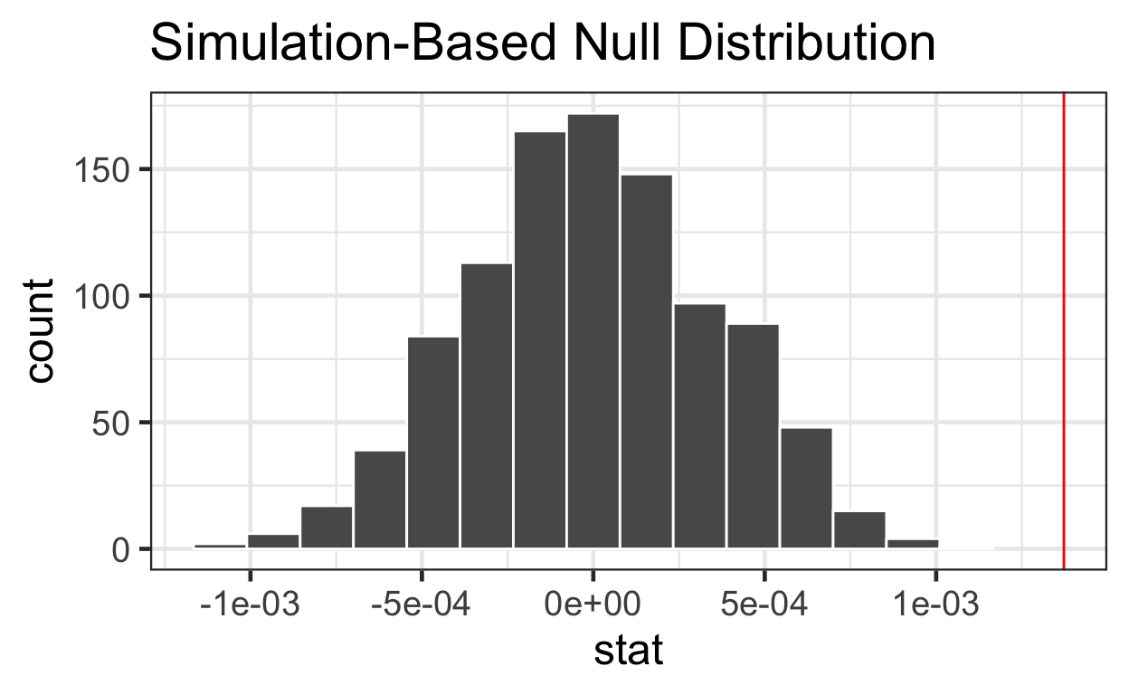
It is apparent from the plot above that our observed estimate is an outlier. If the null hypothesis were true and there was no relationship between distance and velocity, we would expect a result as extreme or more extreme than our observed slope very rarely and thus our observed slope is statistically significantly different from a slope of zero (our null hypothesis of no relationship).
Sampling distributions via bootstrapping
With the carcass data, let’s look ten sorted rows of the original
data and compare them to ten sorted rows of bootstrapped data using
generate(reps = 1, type = "bootstrap"). What’s changed?
   Time   pH log_time
1     1 7.02    0.000
2     1 6.93    0.000
3     2 6.42    0.693
4     2 6.51    0.693
5     4 6.07    1.386
6     4 5.99    1.386
7     6 5.59    1.792
8     6 5.80    1.792
9     8 5.51    2.079
10    8 5.36    2.079
# compare to bootstrapped data
meat %>%
specify(formula = pH ~ log_time) %>%
generate(reps = 1, type = "bootstrap") %>%
arrange(log_time) %>%
head(10)
# A tibble: 10 × 3
# Groups:   replicate [1]
   replicate    pH log_time
       <int> <dbl>    <dbl>
 1         1  6.93    0
 2         1  6.51    0.693
 3         1  6.51    0.693
 4         1  5.99    1.39
 5         1  6.07    1.39
 6         1  5.59    1.79
 7         1  5.59    1.79
 8         1  5.8     1.79
 9         1  5.59    1.79
10         1  5.51    2.08
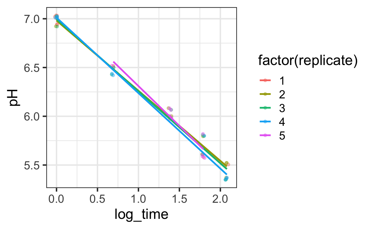
Generate 50 bootstrapped versions and visualize
meat_bootstrap <- meat %>%
    specify(formula = pH ~ log_time) %>%
    generate(reps = 50, type = "bootstrap") %>%
    arrange(replicate, log_time)

meat_bootstrap %>%
  filter(replicate %in% 1:5) %>%
ggplot() +
  aes(x = log_time, y = pH, color = factor(replicate)) +
  geom_jitter(width = .02, height = .02, alpha = .4) +
  geom_smooth(method = "lm", se = FALSE, alpha = .3)
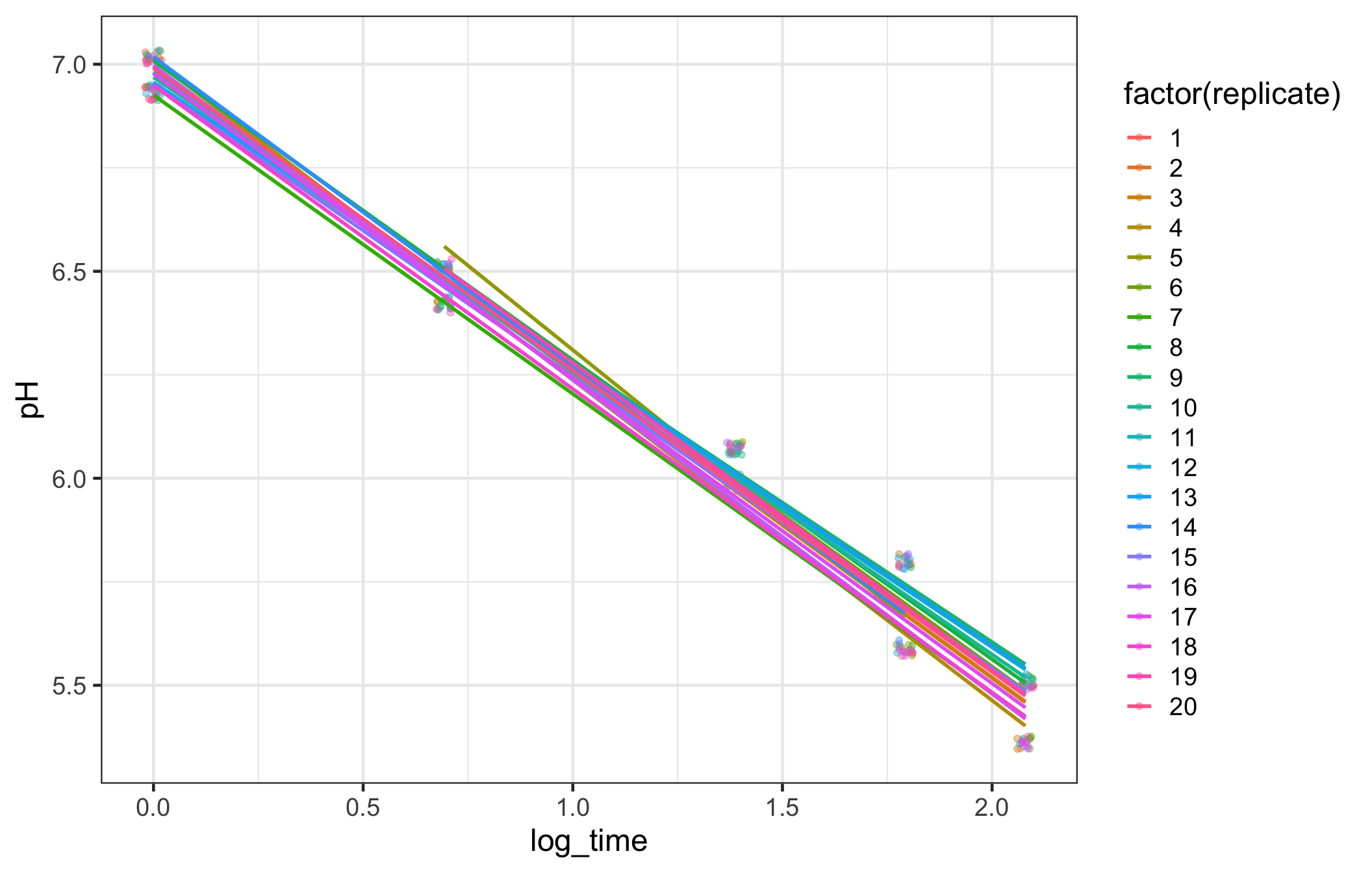
meat_bootstrap %>% filter(replicate %in% 1:20) %>%
ggplot() +
  aes(x = log_time, y = pH, color = factor(replicate)) +
  geom_jitter(width = .02, height = .02, alpha = .4) +
  geom_smooth(method = "lm", se = FALSE, alpha = .3)
Add
calculate(state = "slope")
# base R regression slope
lm(formula = pH ~ log_time, data = meat) %>%
    broom::tidy() %>% kable(digits = 3)
| term | estimate | std.error | statistic | p.value |
|---|---|---|---|---|
| (Intercept) | 6.984 | 0.049 | 143.9 | 0 |
| log_time | -0.726 | 0.034 | -21.1 | 0 |
# calculate regression slope with infer syntax
meat %>%
    specify(formula = pH ~ log_time) %>%
    calculate(stat = "slope")
Response: pH (numeric)
Explanatory: log_time (numeric)
# A tibble: 1 × 1
    stat
   <dbl>
1 -0.726
Add
generate(type = "bootstrap")
meat_slope_bootstrapped <- meat %>%
    specify(formula = pH ~ log_time) %>%
    generate(reps = 1000, type = "bootstrap") %>%
    calculate(stat = "slope")

# look at first 10 bootstrapped slopes
meat_slope_bootstrapped %>%
  filter(replicate %in% 1:10)
Response: pH (numeric)
Explanatory: log_time (numeric)
# A tibble: 10 × 2
   replicate   stat
       <int>  <dbl>
 1         1 -0.756
 2         2 -0.776
 3         3 -0.712
 4         4 -0.781
 5         5 -0.741
 6         6 -0.689
 7         7 -0.707
 8         8 -0.705
 9         9 -0.707
10        10 -0.749
visualize 1000 slopes
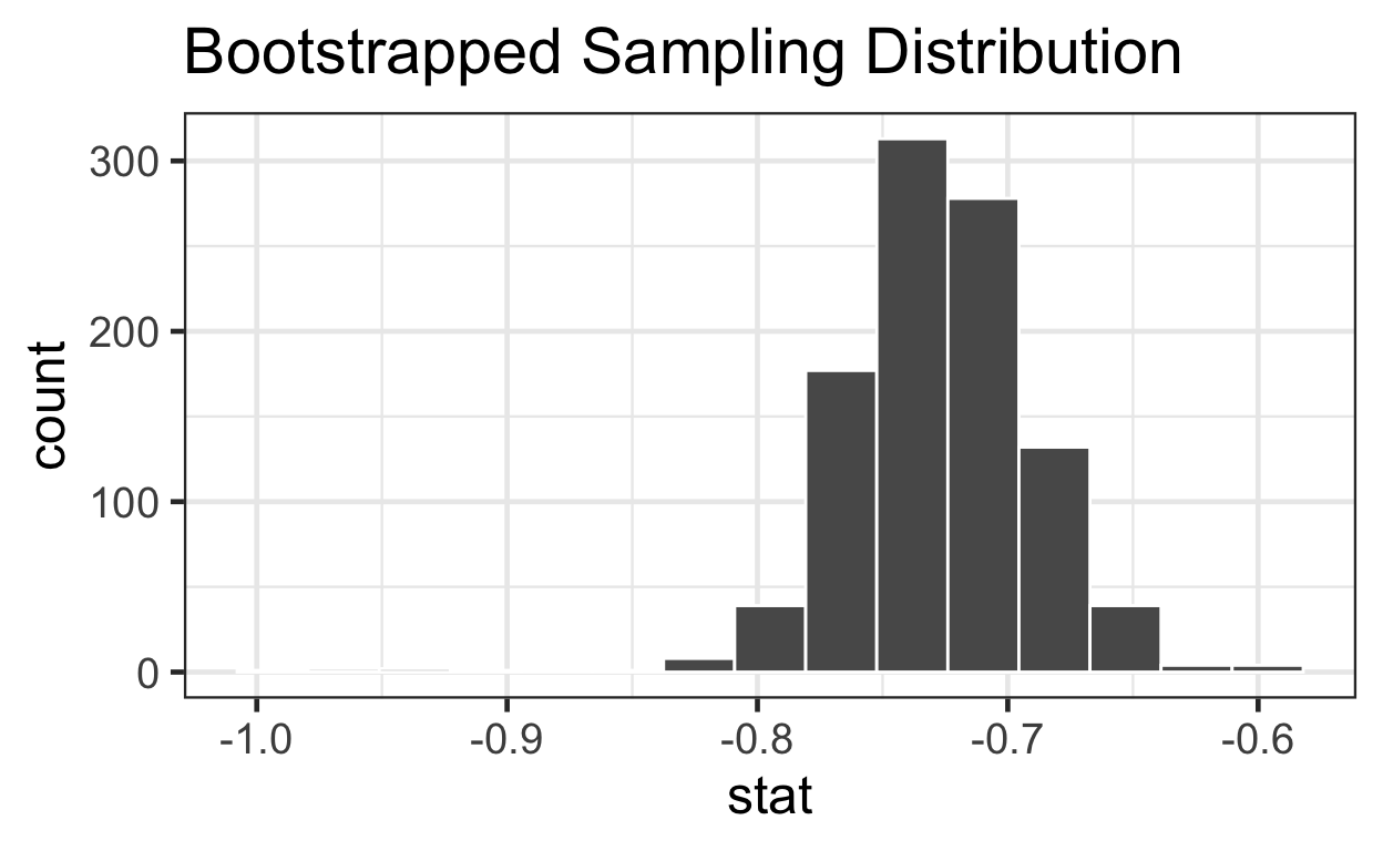
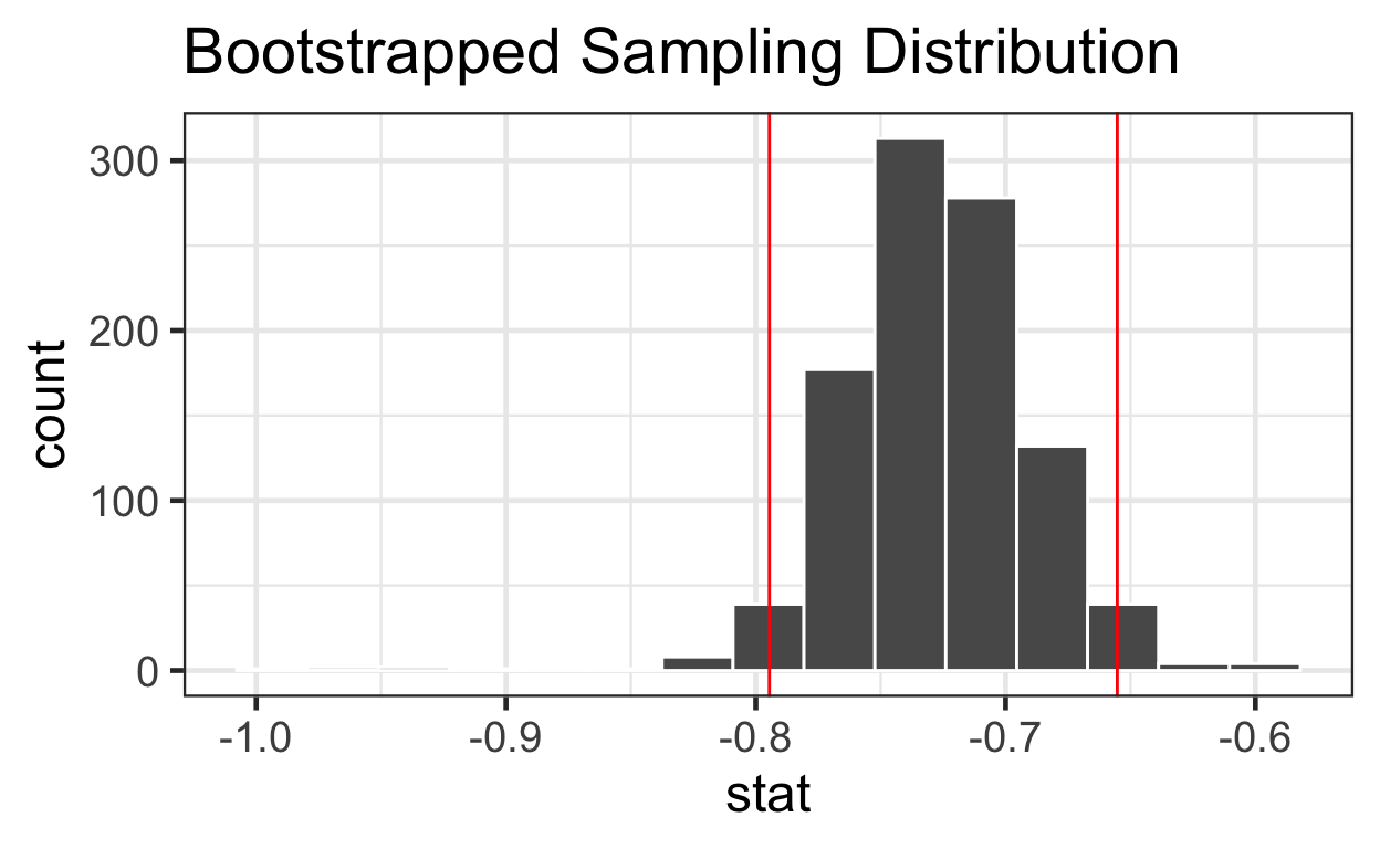
Estimate 95% CI with bootstrap
summary(meat_slope_bootstrapped$stat)
Min. 1st Qu. Median Mean 3rd Qu. Max.
-0.991 -0.751 -0.728 -0.727 -0.704 -0.593 # quantile function sorts vector & returns value at probabilities btwn 0 & 1
quantile(meat_slope_bootstrapped$stat, probs = c(0, .25, .5, .75, 1))
0% 25% 50% 75% 100%
-0.991 -0.751 -0.728 -0.704 -0.593 lower_bound <- quantile(meat_slope_bootstrapped$stat, probs = 0.025)
upper_bound <- quantile(meat_slope_bootstrapped$stat, probs = 0.975)
percentiles <- data.frame(bounds = c(lower_bound, upper_bound))
percentiles
bounds
2.5% -0.795
97.5% -0.655Estimate 95% CI mathematically
# Use estimated slope +/- t-dist with percentile at 0.025 with 8 df * standard error
-0.7256578 + qt(p = 0.025, df = 8) * 0.0344
[1] -0.805-0.7256578 - qt(p = 0.025, df = 8) * 0.0344
[1] -0.646# Use confint function
confint(lm3)
2.5 % 97.5 %
(Intercept) 6.872 7.096
log_time -0.805 -0.646visualize 1000
slopes with 95% CI
meat_slope_bootstrapped %>%
visualize() + ggtitle("Bootstrapped Sampling Distribution") +
geom_vline(data = percentiles, aes(xintercept = bounds), color = "red")
This supplement was put together by Omar Wasow, Sukrit S. Puri, and Blaykyi Kenyah. It builds on prior work by Project Mosaic, an “NSF-funded initiative to improve the teaching of statistics, calculus, science and computing in the undergraduate curriculum.” We are grateful to Nicholas Horton, Linda Loi, Kate Aloisio, and Ruobing Zhang for their effort developing The Statistical Sleuth in R.[@horton2013statistical]
