Introduction: Iris Classification
In 1936, biologist Ronald Fisher published a paper titled “The use of mutiple measurements in taxonomic problems” as a way to classify flower species, based on their observed physical characteristics, including measures such as petal length, sepal width, etc. As part of his conclusions, Fisher analyzed observational data on three different species of irises. The Iris dataset was collected by Edgar Anderson from a pasture in the Gaspé Peninsula. Fifty of each of the three species of irises were plucked and detailed. Once presented with Anderson’s data, Fisher found that certain physical measurements are unique to each of the three species.
In this exercise, we are taking the place of biologist and statistician Ronald Fisher, as we intend to draw conclusions from the Iris dataset in efforts to understand the differences between the three types of irises. By creating easily-interpretable plots using ‘ggplot2’, we should be able to observe these differences that will inform our conclusions.
Scope of Inference
It is important to note that this observational data should not be used to conclusively classify the three types of irises. We cannot disclude the effect of confounding variables. For instance, only two of the three irises present in the dataset were the collected in the Gaspé Peninsula, the remaining fifty irises were collected elsewhere. Perhaps, the climate of the Gaspé Peninsula perhaps explains the physical measurments of the irises collected, more so than the fundamental characteristics of the iris type. In addition, this dataset does not include any qualitative measurements that could also assist differentiating between iris types. However, the results of this exercise should facilitate some classification of the Iris dataset as well as provide a better understanding of how graphical methods can be used to draw conclusions from a given dataset.
Goals of this Exercise
Using the Iris dataset, the goals of this exercise are as follows:
- Understand the importance of creating easily-interpretable plots in understanding the relationship between variables.
- Learn how to use certain ‘ggplot2’ functions that increase the clarity of plots.
- Understand what conclusions can be drawn about variable relationships from graphical representations of data.
Statistical Conclusion
Graphical representations of Anderson’s Iris dataset reveal that the setosa iris exhibits the smallest petal length, despite varying levels of sepal length. The virginica iris overall exhibits both the greatest sepal length and the greatest petal length. Whereas the versicolor iris falls somewhere in between. Both the versicolor and virginica iris show that increase in sepal length correlates to an increase in petal length. While this may not exactly mirror the analysis performed by Ronald Fisher, this exercise shows the importance of easily-interpretable graphs in providing conclusions of the relationships between variables in classifying irises.
Set-Up
Single Variable Plotting
We will work with the iris dataset, which holds the following data:
iris[1:5,] %>%
  kable() %>%
    kable_styling(
      bootstrap_options = c("striped", "condensed"),
    full_width = FALSE)
| Sepal.Length | Sepal.Width | Petal.Length | Petal.Width | Species |
|---|---|---|---|---|
| 5.1 | 3.5 | 1.4 | 0.2 | setosa |
| 4.9 | 3.0 | 1.4 | 0.2 | setosa |
| 4.7 | 3.2 | 1.3 | 0.2 | setosa |
| 4.6 | 3.1 | 1.5 | 0.2 | setosa |
| 5.0 | 3.6 | 1.4 | 0.2 | setosa |
In dealing with continuous variables (in iris, sepal length, sepal width, petal lentgh and petal width) to map a categorical variable (in iris, species), the first question we will seek to answer is whether we can draw any conclusions on each type of iris based on a single continuous variable. Specifically, we will examine how iris species have varying sepal.lengths.
Types of Visualizations
There are many ways to visualize one variable using ggplot2. For example, we can use density plots, dotplots, histograms, and boxplots, visualized in the respective order in the plot below.
#Plotting various visualizations
area <- ggplot(data = iris) +
          aes(x = Sepal.Length) +
          geom_density()
dot  <- ggplot(data = iris) +
          aes(x = Sepal.Length) +
          geom_dotplot()
hist <- ggplot(data = iris) +
          aes(x = Sepal.Length) +
          geom_histogram()
box  <- ggplot(data = iris) +
          aes(x = factor(0),
              y = Sepal.Length) +
          geom_boxplot() +
          xlab(" ") +
          coord_flip()

grid.arrange(area, dot, hist, box,
             ncol = 2,
             top  = "Single Variable Visualizations")
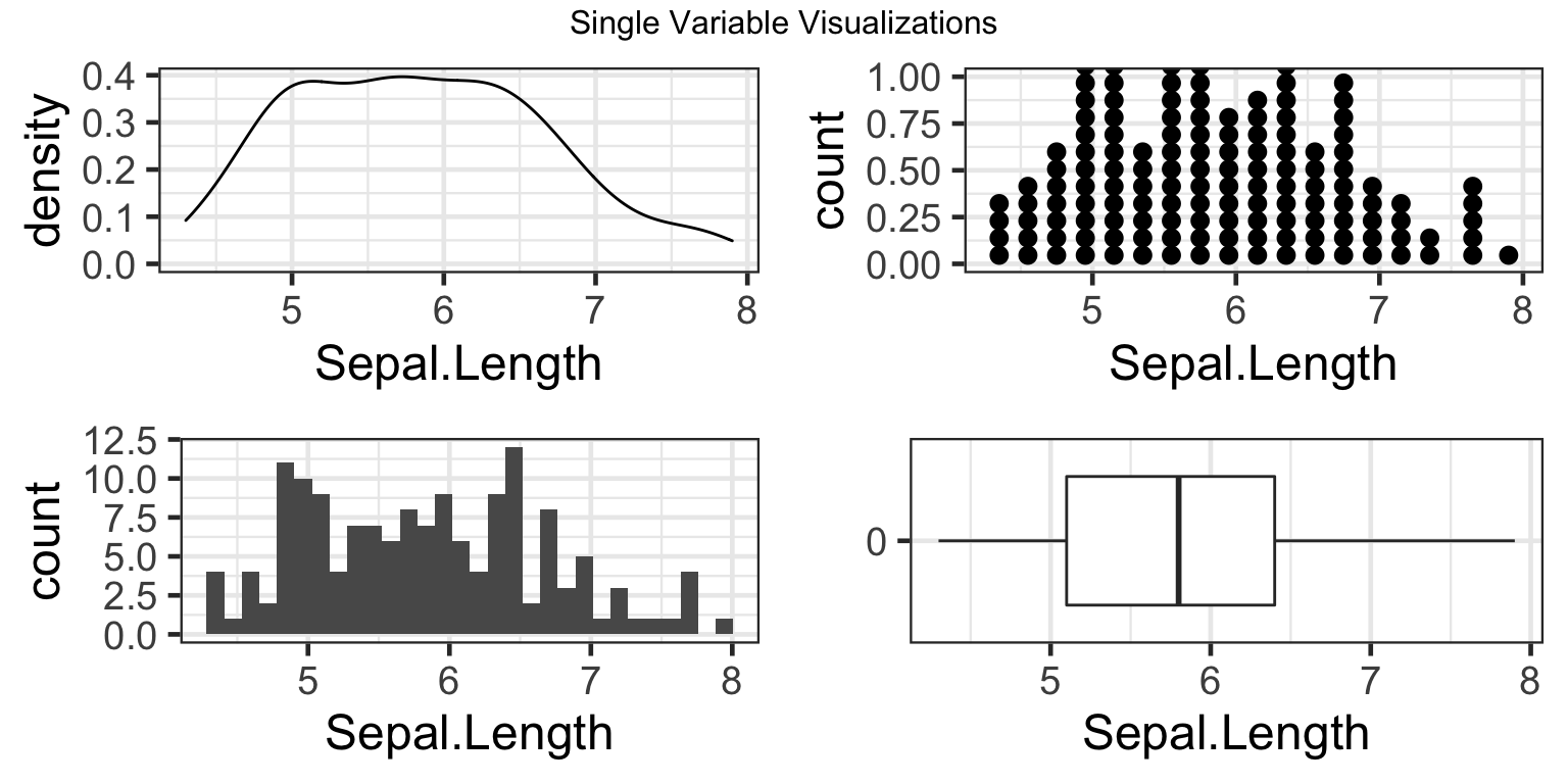
However, each of these visualizations show little information concerning how sepal.length varies by species of iris. Instead, they give us the overall distribution of all sepal.lengths in the dataset, irrelevant of species type. Going forward, this exercise will further specify how to adjust axes, labels, and finally, the aesthtics of the histogram plot in particular, to make the information easier to interpret.
Axes Manipulation
The first type of manipulation we will apply to make the histogram information easier to interpret is setting the scale of the axes. As of now, the highest peak in the histogram is very close to the maximum value, 12.5. Let us elongate the scale to 15, as to give us a more balanced view of the data, that does not cap the y axis close to the maximum value.
1. Changing the scale of the y axis
To manipulate the scale of the continuous y axis in ggplot, we will use the parameter “limits” of the function scale_y_continuous(). The “limits” parameter will take the form of limits = c(min scale, max scale) as in the example code below:
# Change y axis limits
hist <- hist + #integrating change to new "hist" plot, so that our scale transformation will load for each subsequent plot
  scale_y_continuous(limits=c(0, 15)) #where 0 is minimum scale and 15 is maximum scale
hist
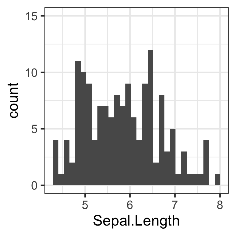
We have now successfully modified the scale of the y axis. The same process can be applied to modify the x axis scale, with the function scale_x_continuous().
2. Changing the breaks of the x axis
Next, we want to see a more detailed breakdown of the x axis, as a small change in sepal.length may indicate a divisive change for the iris type. Instead of seeing the sepal.length ticks at every “1” value, let us set the ticks at every “0.5” value in order to visualize the data at more specific intervals.
To manipulate the breaks of the x axis, we will use the parameter “breaks” within the function scale_x_continuous(). The “breaks” parameter will take the form of breaks = seq(min scale, max scale, tick mark intervals) as in the example code below:
hist <- hist + # updating histogram with new tick marks
  scale_x_continuous(breaks=seq(0, 8, 0.5)) # 0.5 represents the desired tick mark intervals
hist
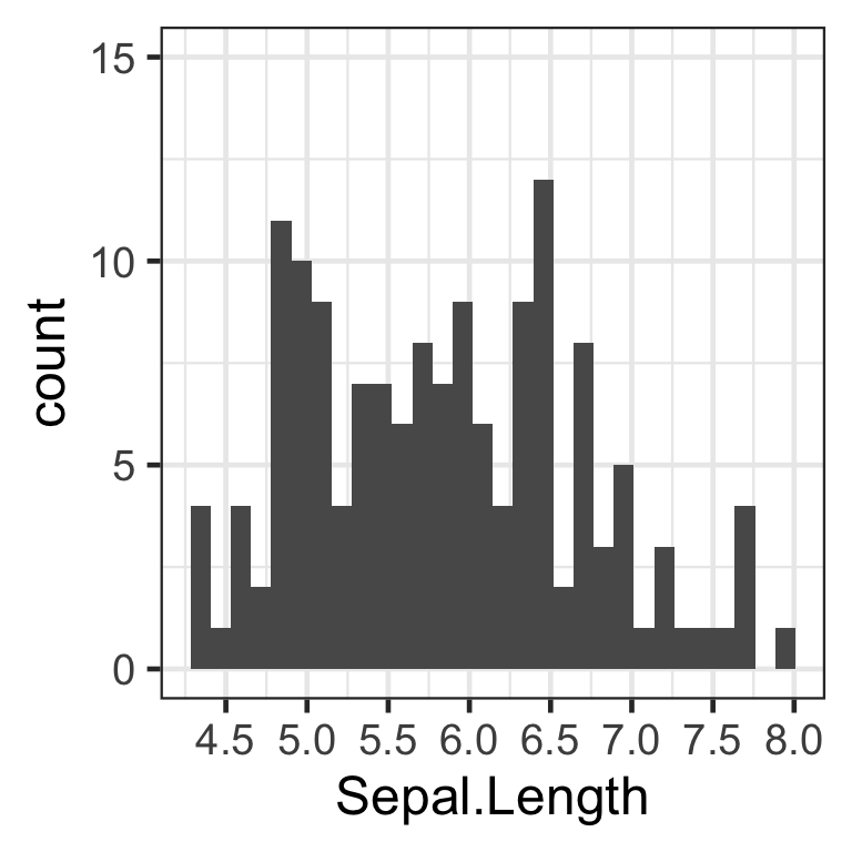
We have now successfully modified the tick marks of the x axis. The same process can be applied to modify the y axis scale, with the function scale_y_continuous().
3. Changing the appearance of the x and y axes
Finally, we want to see the numbers on the axis ticks more clearly, as they seem small on the histogram for now. Let us change the size of the font to make it bigger, make the font bold, and rotate the axis ticks by 45 degrees so that the numbers do not overlap.
This can be done with the theme(axis.text.x) and theme(axis.text.y) functions, with the parameters element_text(face = “some specification”, size = “some size”, angle =“some angle”) as in the example code below:
hist <- hist +
    theme(
        axis.text.x = element_text(
          size      = 11,
          face      = "bold", # options: "plain", "italic", "bold",  "bold.italic"
          angle     = 45
          ),
        axis.text.y = element_text(
          size      = 11,
          face      = "bold",
          angle     = 45)
        )
hist
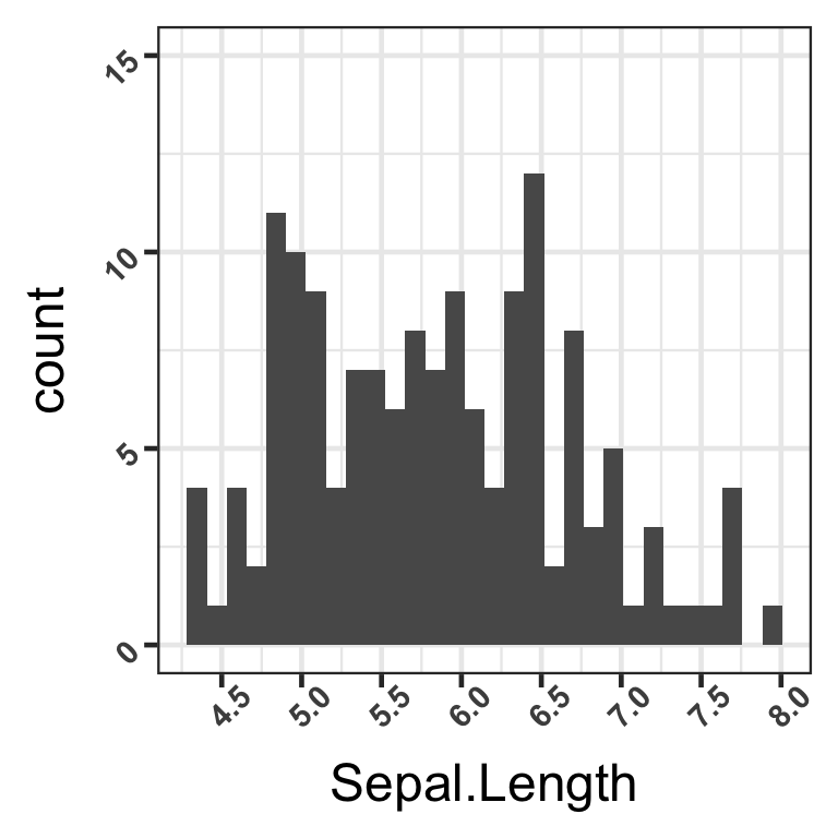
We have now successfully modified the appearance of the marks on both axes.
Labels
The second type of manipulation we will apply to make the histogram information easier to interpret is labeling the histogram. As of now, we are unsure what the graph describes due to the lack of title, what each axis represents, as well as where the data is from. Let us understand what exactly the histogram is referring to, by adding labels to the title, each axis, and a caption.
1. Labeling the title, subtitle, axes, and caption
All these specifications can be done with one function, labs. The parameters we will modify are “title”, “subtitle”, “x”, “y”, and “caption”, as we put the desired value of the label in “quotation marks” as in the example code below:
hist <- hist +
    labs(
        title    = "Sepal Length by Iris Species Type",
        subtitle = "Visualization through a Histogram",
        x        = "Sepal Length",
        y        = "Frequency",
        caption  = "Data is from 'iris' dataset"
    )

hist
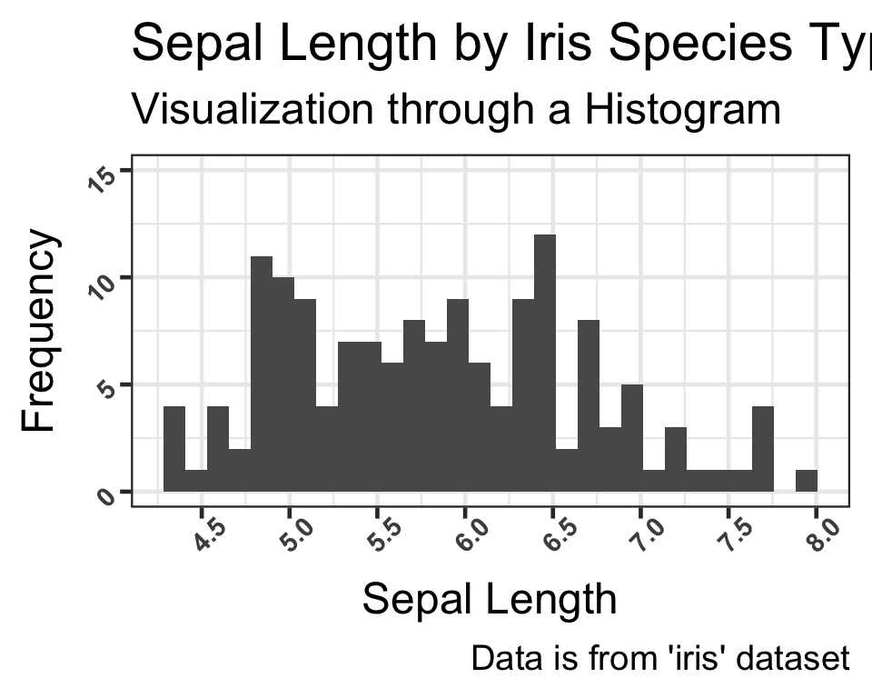
We have now added labels to the histogram through the “labs” function.
2. Changing the appearance of the labels
As we did with the tick marks, we can further customize the appearance of the labels using the functions plot.title, axis.title.x, and axis.title.y, with the parameter “element_text(color=”desired color”, size=“desired size”, and face =desired face”). “Theme” encompasses these specifications as in the example code below:
hist <- hist + theme(
    plot.title   = element_text(color = "red", size = 12, face = "bold"),
    axis.title.x = element_text(color = "blue", size = 11, face = "italic"),
    axis.title.y = element_text(color = "blue", size = 11, face = "italic")
)

hist
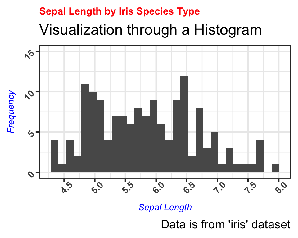
We have now successfully learned to change the color, size, and face type of the labels as well.
Aesthetics
The last type of manipulation we will apply to make the histogram information easier to interpret is to actually subset the data based on the species type. As of now, we can only see the distribution of the total sepal length, but we want to determine whether the sepal length varies by the three types of iris species.
We will modify the aes() function and specify the parameter “color” by the species, then modify the geom_histogram() function and specify the parameters “fill” by white and “position” to dodge in order to ensure we can see each species type. We add all the specifications previously applied.
hist <- ggplot(data = iris) +
    aes(x     = Sepal.Length,
        color = Species) +
    scale_y_continuous(limits = c(0, 15)) +
    scale_x_continuous(breaks = seq(0, 8, 0.5)) +
    theme(
        axis.text.x = element_text(size = 11, face = "bold", angle = 45),
        axis.text.y = element_text(size = 11, face = "bold", angle = 45)
    ) +
    geom_histogram(fill = "white", position = "dodge") + labs(
        title    = "Sepal Length by Iris Species Type",
        subtitle = "Visualization through a Histogram",
        x        = "Sepal Length",
        y        = "Frequency",
        caption  = "Data is from ggplot2 package's 'iris' dataset"
    ) +
    theme(
        plot.title   = element_text(color = "red", size = 12, face = "bold"),
        axis.title.x = element_text(color = "blue", size = 11, face = "italic"),
        axis.title.y = element_text(color = "blue", size = 11, face = "italic")
    )

hist
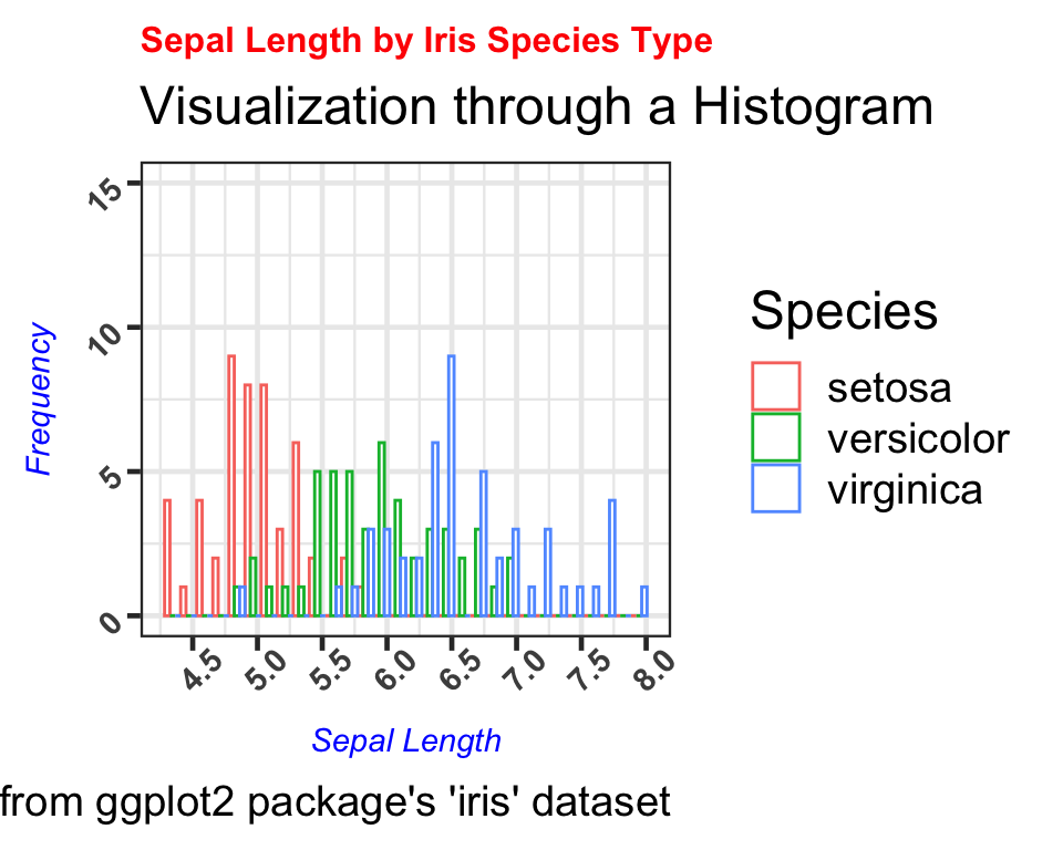
We can now visualize each species type by the sepal length frequency and observe that setosa has the shortest sepal lengths, followed by versicolor and virignica species.
Bi-Variate Plotting
Having explored plotting the single variable “Sepal.Length”, we can now advance to bi-variate plotting to further observe how to classify irises based on the their physical measurements. In this case, we will be exploring the relationship between two continuous variables- “Sepal.Length” and “Petal.Length” and how these two variables can help us in iris classification.
Our basic plot of “Sepal.Length” against “Petal.Length” is presented below:
# creating a basic plot, saved as "bi_plot"
bi_plot <- ggplot(data = iris) +
    aes(x = Sepal.Length,
        y = Petal.Length) +
    geom_point()

# printing basic plot
bi_plot
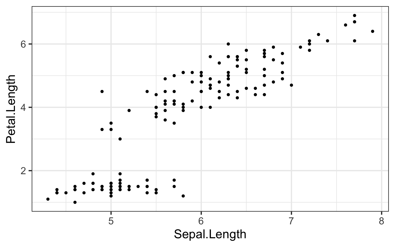
Evidently, this graph is cannot be easily interpretted. All we can understand is that for most of the irises collected, greater sepal length correlates with greater petal length. However, there is a cluster of cases in which sepal length differs, but petal length remains largely consistent. Perhaps we can deduce that this may be the case for a specific type of iris, but given the our current plot we cannot make any such conclusion. In addition, from this plot a reader cannot definitely know in what units both variables are measured, nor the overall comparison that is plotted.
Axes
# taking the scatter plot "bi-plot" above, we need to add clarity to our basic plot
# one way of increasing clarity is adjusting the axes of the plot
# adjusting axes can include:
# creating upper and lower limits (in this case, this seems unnecessary)
# changing the breaks along axes

# adjusting axis scales to include more specific breaks along both axes
# this increases the granularity with which can observe the relationship between "Sepal.Length" and "Petal.Length"
bi_plot2 <- ggplot(data = iris) +
    aes(x = Sepal.Length,
        y = Petal.Length) +
    geom_point() #saved as new plot

# using the 'scale_x_continuous()' and 'scale_y_continuous()' to increase granularity of variable measurements
# 'breaks' manually determines the way axes ticks are labeled
# 'seq' determines the 'breaks' according to the formula --> seq(min, max, by = how often breaks occur)
bi_plot2 +
    scale_x_continuous(breaks = seq(0, 8, by = 0.5)) +
    scale_y_continuous(breaks = seq(0, 7, by = 0.5))
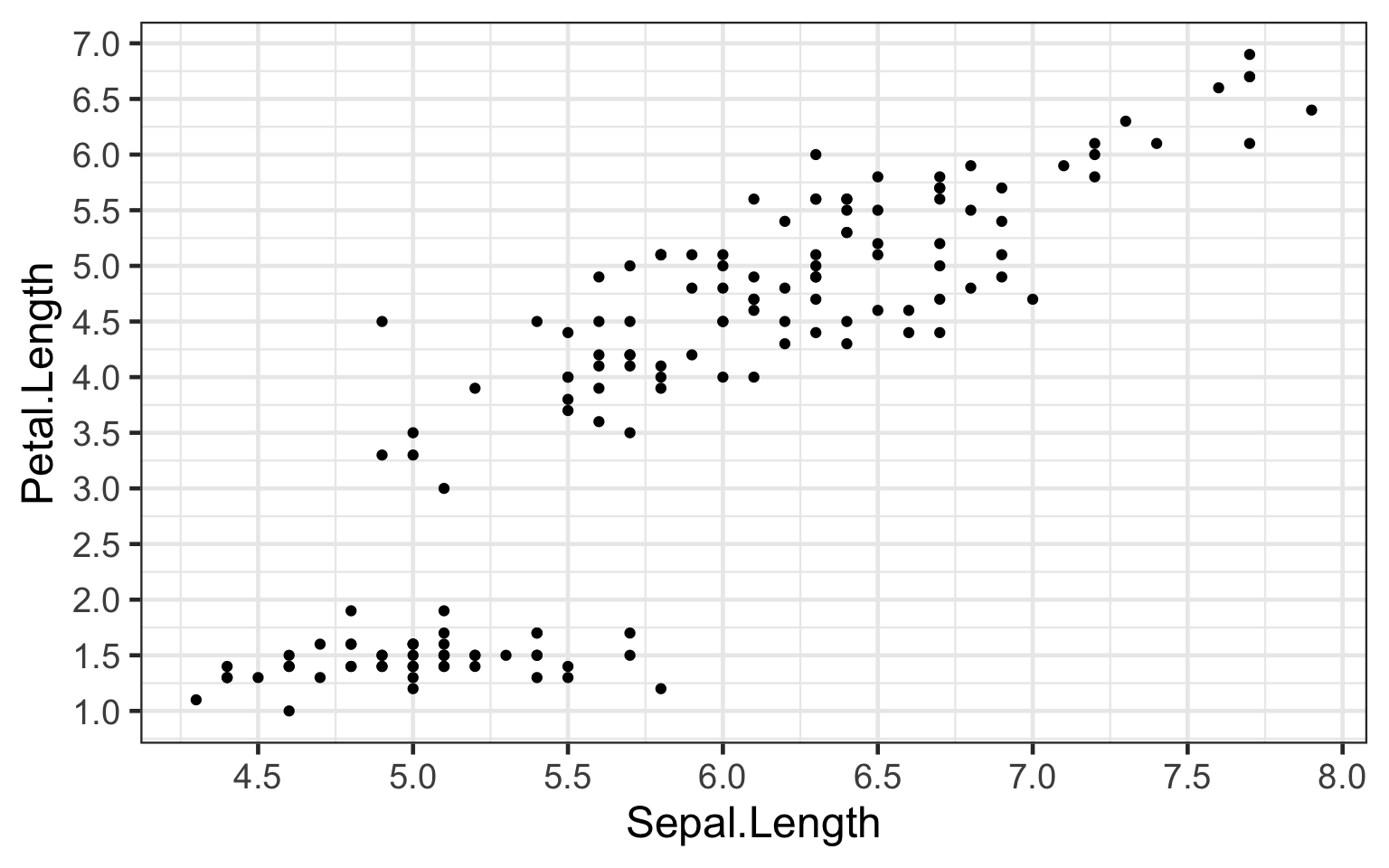
“Bi_plot2” shows increased granularity of “Sepal.Length” and “Petal.Length” variables, from which we can observe how small increases in sepal length can correlate to increases petal length.
Labels
# taking the scatter plot "bi-plot2" above, we still lack some clarity
# we still do not know the units for which our two variables are measured
# plot interpretability could be improved by adding:
# 1. better-labeled axes including units of measurements
# 2. a plot title

# current state of plot
bi_plot3 <- ggplot(data = iris) +
    aes(x = Sepal.Length,
        y = Petal.Length) +
    geom_point() +
    scale_x_continuous(breaks = seq(0, 8, by = 0.5)) +
    scale_y_continuous(breaks = seq(0, 7, by = 0.5))

# 1. better-labeled axes including units of measurements
# just as we adjusted the plot's breaks, we can similarly use 'scale_x_continuous()' and 'scale_y_continuous()'
# to label our axes
bi_plot3 <- ggplot(data = iris) +
    aes(x = Sepal.Length,
        y = Petal.Length) +
    geom_point() +
    scale_x_continuous("Sepal Length (cm)", breaks = seq(0, 8, by = 0.5)) +
    scale_y_continuous("Petal Length (cm)", breaks = seq(0, 7, by = 0.5))

# 2. adding a title
bi_plot3 +
    labs(title = "Comparing the Relationship between Iris sepal length and petal length") + # adding a title
    theme(plot.title = element_text(hjust = 0.5, face = 'bold')) # center & bold title using the "theme" tool
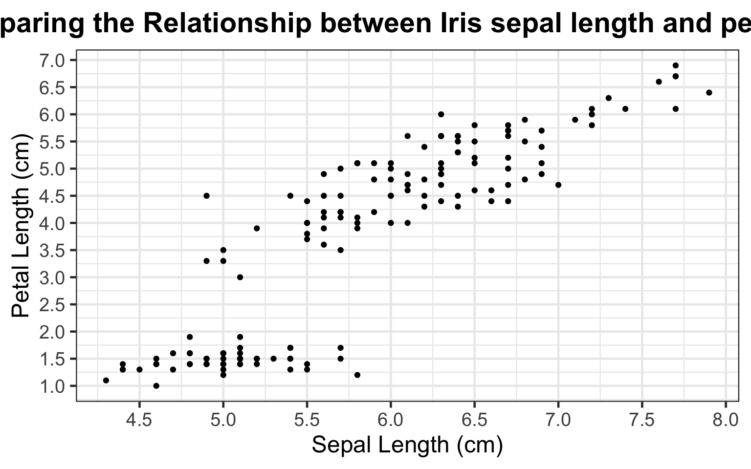
By adding better-labeled axes and a title, any reader can easily understand that the graph depicts a comparison of sepal length and petal length, both measured in centimeters. Additionally, across all types of irises, larger sepal length (cm) correlates largely correlates with larger petal length (cm), except in the case of the cluster of points in the bottom left of the plot. Our current plot cannot currently explain this cluster.
Aesthetics
The goal of our graphical representation of the data is to better understand the differences between iris types. However, the current state of scatter plot, though correctly adjusted and labeled does not discern any such differences. In its current state, we can only conclude that increases in sepal length (cm) seems to largely correlate increased petal length (cm) except for a cluster of irises that do not show a difference in petal length (cm) despite increased sepal length (cm).
# taking the scatter plot "bi-plot3" above, we cannot discern differences in iris type
# plot interpretability could be improved by:
# discerning difference in the scatter plots points by iris type

# current state of plot
bi_plot4 <- ggplot(data = iris) +
    aes(x = Sepal.Length,
        y = Petal.Length) +
    geom_point() +
  scale_x_continuous("Sepal Length (cm)", breaks = seq(0, 8, by = 0.5)) +
  scale_y_continuous("Petal Length (cm)", breaks = seq(0, 7, by = 0.5)) +
  labs(title = "Comparing the Relationship between Iris sepal length and petal length") + # adding a title
  theme(plot.title = element_text(hjust = 0.5, face = 'bold')) # center & bold title using the "theme" tool

# using the 'color' tool within ggplot2 we can graphically see which points correspond to a type of iris
bi_plot4 <- ggplot(data = iris) +
    aes(x     = Sepal.Length,
        y     = Petal.Length,
        color = Species) +
    geom_point() + # color tool
  scale_x_continuous("Sepal Length (cm)", breaks = seq(0, 8, by = 0.5)) +
  scale_y_continuous("Petal Length (cm)", breaks = seq(0, 7, by = 0.5)) +
  labs(title = "Comparing the Relationship between Iris sepal length and petal length") + # adding a title
  theme(plot.title = element_text(hjust = 0.5, face = 'bold')) # center & bold title using the "theme" tool
# printing final plot
bi_plot4
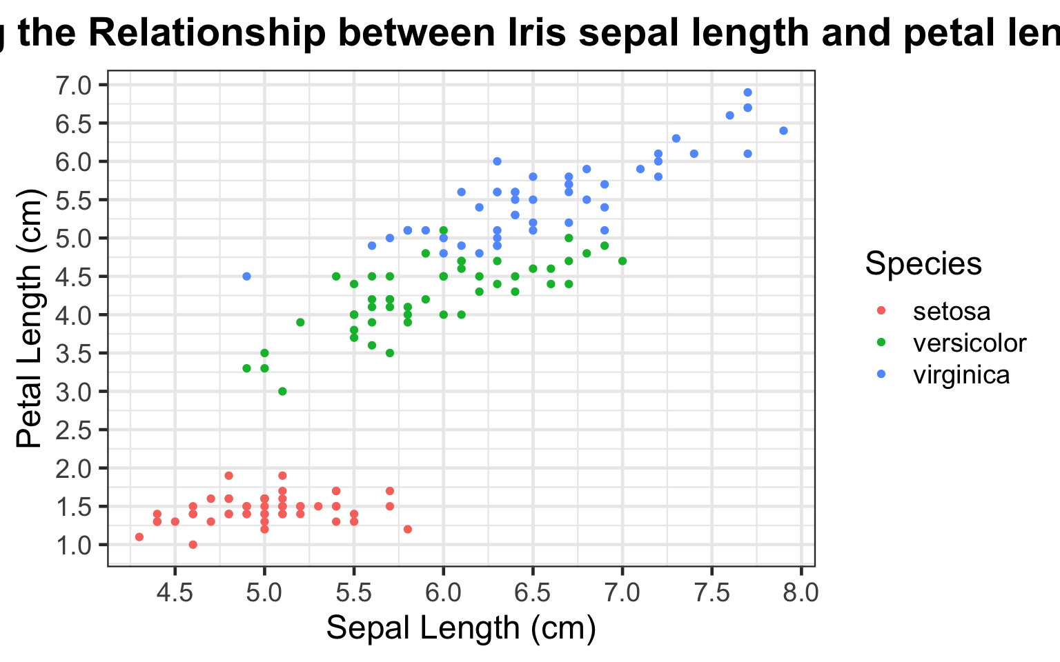
By coloring the scatter plot points by iris species type, we can now clearly observe the differences in the sepal and petal length across each of the three type of irises. We see that the setosa iris exhibits the shortest petal length from 1-2 centimeters, regardless of varying sepal lengths from ranging from 4-5.8 centimeters. Additionally, of the three types of irises included in this dataset, the virginica iris shows the greatest sepal and petal length.
Conclusion
Evidently, the increasingly specific plots are more interpretable and lead to more confident conclusions about the differences in the iris types. As a result, Ronald Fisher can better understand and classify irises based on their physical measurments. More broadly, this exercises shows the importance of creating easily-interpretable plots in aiding our statistical conclusions.
This supplement was put together by Patrick Cha, Christine Jeong and Omar Wasow.