Introduction
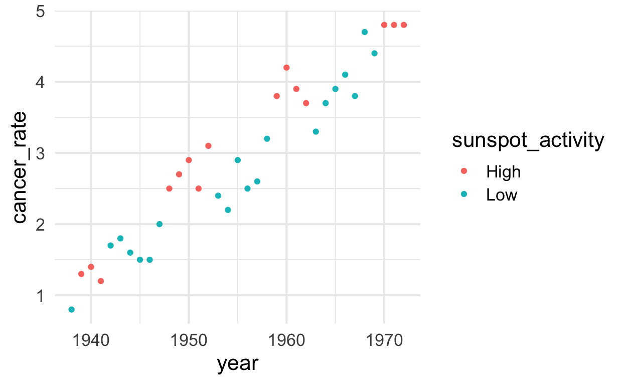
Data contains yearly skin cancer rates (per 100,000 people) in Connecticut from 1938 to 1972 with a code indicating those years that came two years after higher than average sunspot activity and those years that came two years after lower than average sunspot activity.
Setup
knitr::opts_chunk$set(echo = TRUE)
theme_set(theme_minimal(base_size = 16))
Load data
solar <- Sleuth3::ex0323 %>% clean_names()

dim(solar)
[1] 35 3head(solar)
  year cancer_rate sunspot_activity
1 1938         0.8              Low
2 1939         1.3             High
3 1940         1.4             High
4 1941         1.2             High
5 1942         1.7              Low
6 1943         1.8              Low
Plot data
solar %>%
  ggplot() +
  aes(y = cancer_rate, x = year, color = sunspot_activity) +
  geom_point()
Run models
# single mean model (one intercept)
lm_mean    <- solar %>% lm(cancer_rate ~ 1, data = .)

# two mean model (two intercepts)
lm_sunspot <- solar %>% lm(cancer_rate ~ sunspot_activity, data = .)

# single conditional model (one slope, one intercept)
lm_year    <- solar %>% lm(cancer_rate ~ year, data = .)

# single conditional mean + mean shift (one slope, two intercepts)
lm_sunspot_and_year <- solar %>% lm(cancer_rate ~ sunspot_activity + year, data = .)
Look at table of results
stargazer(
  lm_mean, lm_sunspot, lm_year, lm_sunspot_and_year,
  type = "html", header = FALSE, digits = 2, omit.stat = c("f", "ser")
  )
| Dependent variable: | ||||
| cancer_rate | ||||
| (1) | (2) | (3) | (4) | |
| sunspot_activityLow | -0.44 | -0.44*** | ||
| (0.40) | (0.09) | |||
| year | 0.11*** | 0.11*** | ||
| (0.01) | (0.004) | |||
| Constant | 2.92*** | 3.17*** | -212.00*** | -212.00*** |
| (0.20) | (0.30) | (11.30) | (8.68) | |
| Observations | 35 | 35 | 35 | 35 |
| R2 | 0.00 | 0.04 | 0.92 | 0.95 |
| Adjusted R2 | 0.00 | 0.01 | 0.91 | 0.95 |
| Note: | p<0.1; p<0.05; p<0.01 | |||
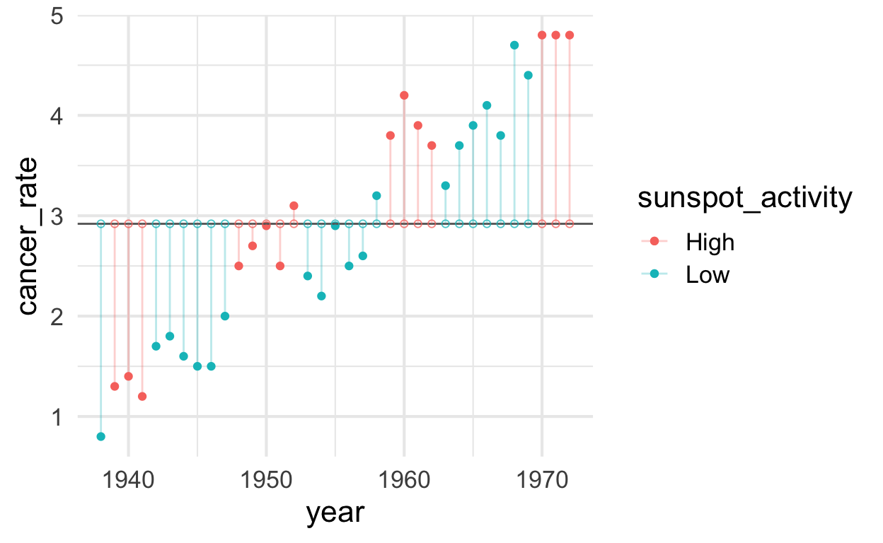
Cancer rate modeled from single mean
cancer_rate_mean <- mean(solar$cancer_rate)

solar$predicted_with_mean <- predict(lm_mean)   # Save the predicted values
solar$residuals_with_mean <- residuals(lm_mean) # Save the residual values

plot_single_mean <- solar %>%
  ggplot() +
  aes(x = year, y = cancer_rate, color = sunspot_activity) +
  geom_point() +
  geom_hline(aes(yintercept = cancer_rate_mean), color = "gray40") +
  geom_segment(aes(xend = year, yend = predicted_with_mean), alpha = .3) +  # alpha to fade lines
  geom_point(aes(y = predicted_with_mean), shape = 1, size = 1.5, alpha = .75)

plot_single_mean
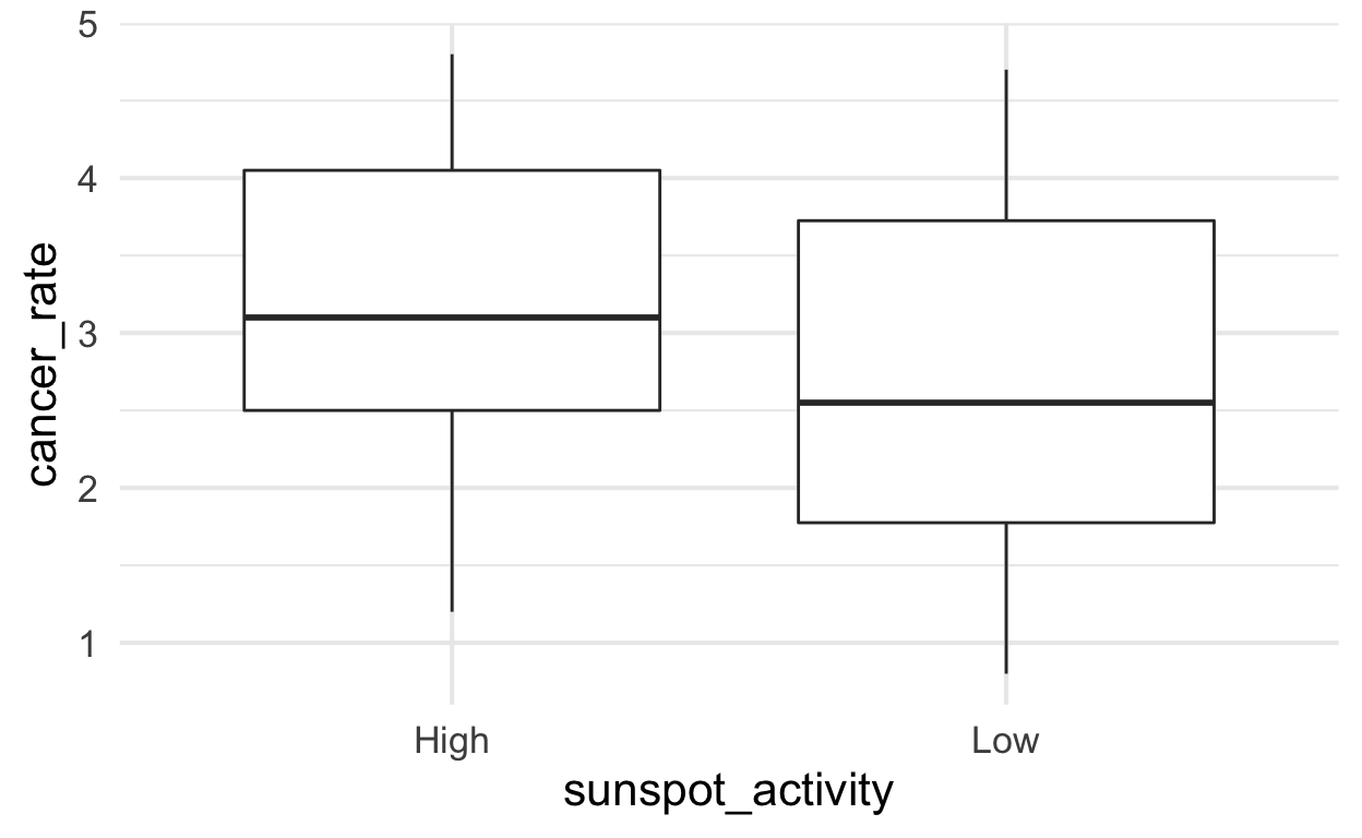
Cancer rate modeled from two means by sunspot_activity (without year)
Imagine we did not know about the year time trend. In that scenario, we would simply have two groups of data defined by sunspot activity. To visualize differences between two or more groups of values, boxplots are commonly used. As we can see, the distributsion look like they might be different but with a lot of variation so it is hard to know.
solar %>%
  ggplot() +
  aes(y = cancer_rate, x = sunspot_activity) +
  geom_boxplot()
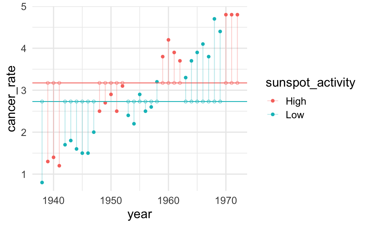
Once we plot the data with year on the \(x\)-axis it becomes much more clear why
there is so much unexplained variation.
cancer_rate_mean_high <- mean(solar$cancer_rate[solar$sunspot_activity == "High"])
cancer_rate_mean_low  <- mean(solar$cancer_rate[solar$sunspot_activity == "Low"])

solar$predicted_without_year <- predict(lm_sunspot)   # Save the predicted values
solar$residuals_without_year <- residuals(lm_sunspot) # Save the residual values

plot_sunspot <- solar %>%
  ggplot() +
  aes(x = year, y = cancer_rate, color = sunspot_activity) +
  geom_point() +
  geom_hline(aes(yintercept = cancer_rate_mean_high), color = "#F8766D") + # ggplot red
  geom_hline(aes(yintercept = cancer_rate_mean_low),  color = "#00BFC4") + # ggplot blue
  geom_segment(aes(xend = year, yend = predicted_without_year), alpha = .3) +  # alpha to fade lines
  geom_point(aes(y = predicted_without_year), shape = 1, size = 1.5, alpha = .75)

plot_sunspot
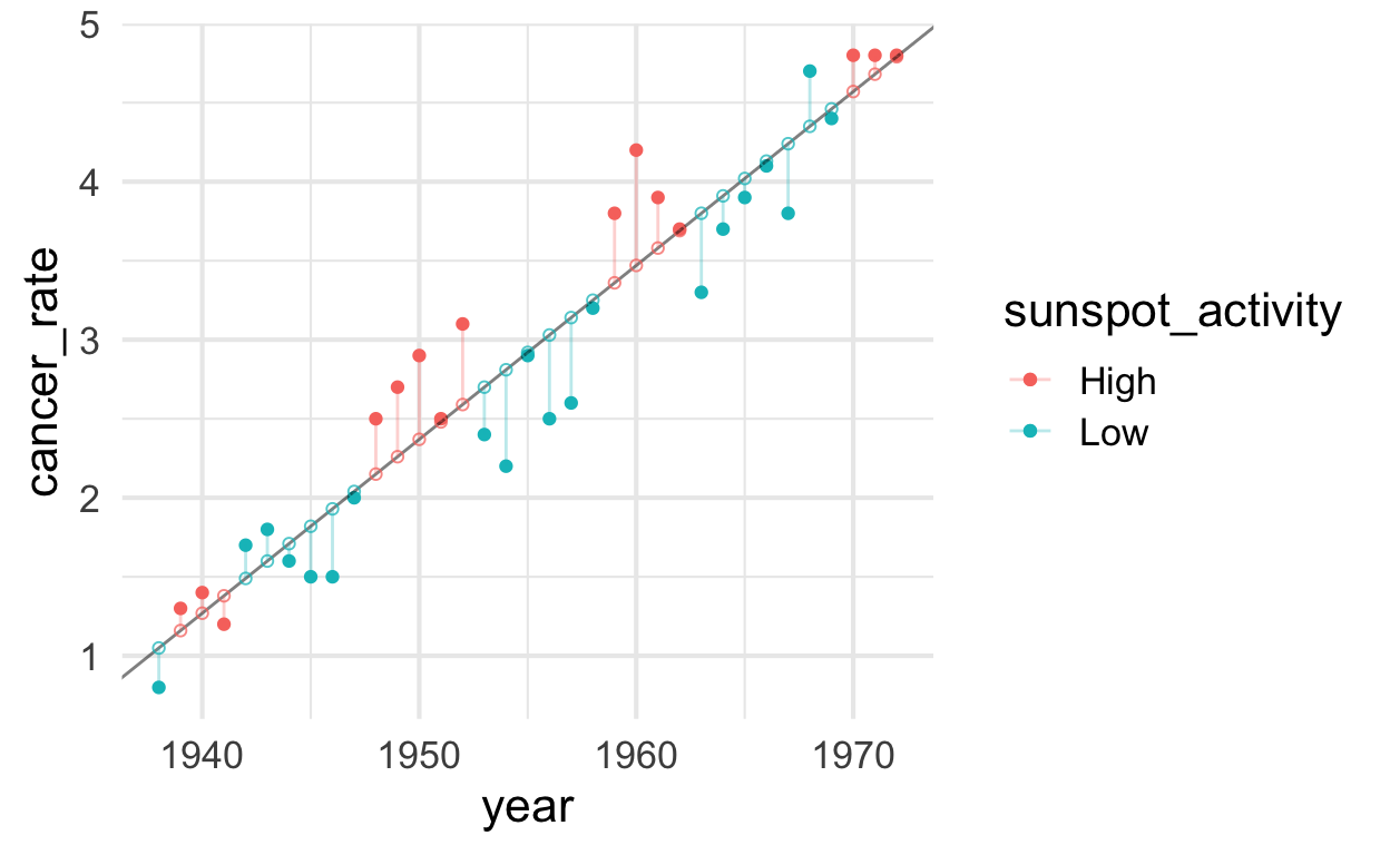
Cancer as a function of conditional mean by year
solar$predicted_with_year_no_sunspot <- predict(lm_year)   # Save the predicted values
solar$residuals_with_year_no_sunspot <- residuals(lm_year) # Save the residual values

plot_year_no_sunspot <- solar %>%
  ggplot() +
  aes(x = year, y = cancer_rate, color = sunspot_activity) +
  geom_point() +
  geom_abline(aes(intercept = lm_year$coefficients[1], slope = lm_year$coefficients[2]), alpha = .5) +
  geom_segment(aes(xend = year, yend = predicted_with_year_no_sunspot), alpha = .3) +  # alpha to fade lines
  geom_point(aes(y = predicted_with_year_no_sunspot), shape = 1, size = 1.5, alpha = .75)

plot_year_no_sunspot
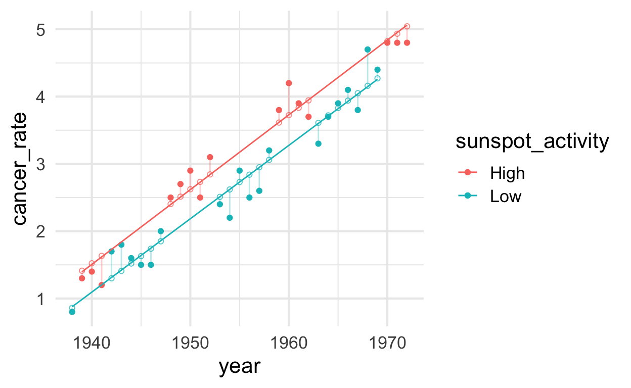
Cancer as a function of sunspot_activity with year
solar$predicted_with_year <- predict(lm_sunspot_and_year)   # Save the predicted values
solar$residuals_with_year <- residuals(lm_sunspot_and_year) # Save the residual values

plot_sunspot_and_year <- solar %>%
  ggplot() +
    aes(x = year, y = cancer_rate, color = sunspot_activity) +
    geom_point() +
    geom_smooth(method = "lm", se = FALSE, size = .5) +
    geom_segment(aes(xend = year, yend = predicted_with_year), alpha = .3) +  # alpha to fade lines
    geom_point(aes(y = predicted_with_year), shape = 1, size = 1.5, alpha = .75)

plot_sunspot_and_year
Plot models
p1 <-
  plot_model(lm_sunspot, type = "pred", terms = "sunspot_activity") +
  scale_y_continuous(limits = c(0, 4)) +
  ggtitle("Without year trend")

p2 <-
  plot_model(lm_sunspot_and_year, type = "pred", terms = c("sunspot_activity")) +
  scale_y_continuous(limits = c(0, 4)) +
  ggtitle("With year trend")

# combine plots
cowplot::plot_grid(p1, p2, labels = c("A", "B"))
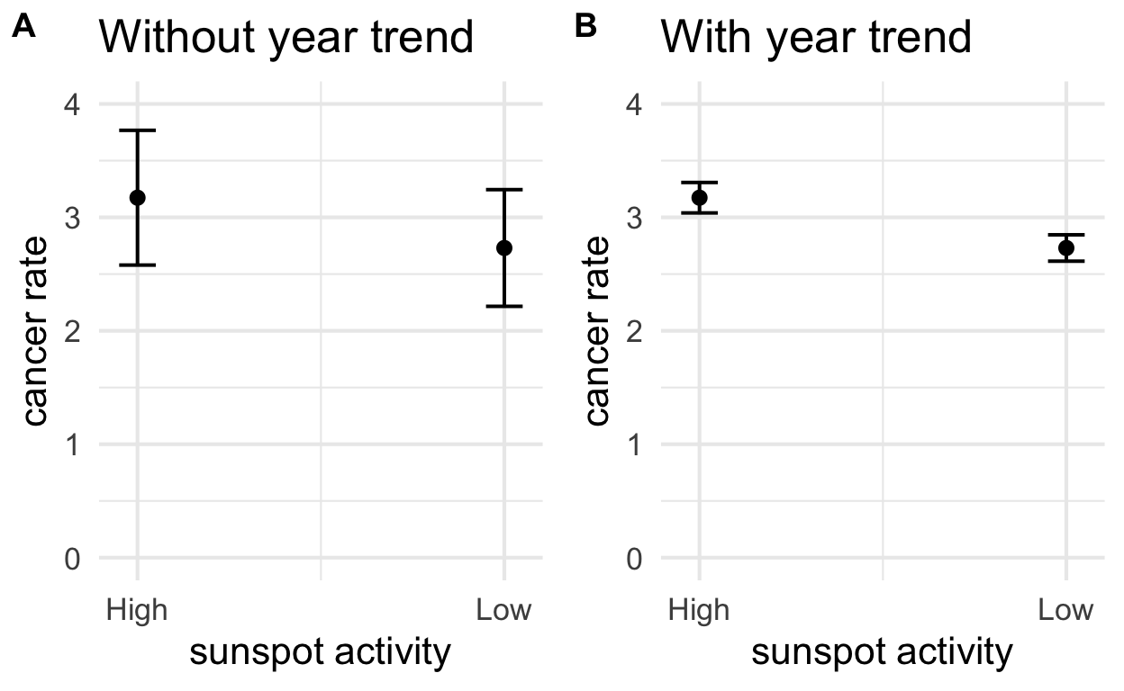
In pane (A), we see the model that does not control for year trends. There is a lot of unexplained variation and the estimates have wide confidence intervals. In pane (B), the model does control for year and we are better able to isolate an effect of sunspot activity.
Additional explanation
In this example, we remove the “year effect” by removing the
conditional mean. In other words, we have a model for a
predicted value of cancer rates by year cancer ~ year. Once
we account for that, we can then ask is there a significant difference
between the residuals for high sunspot years vs low sunspot years?
Put another way, if we know the year and have a model, we can make a good prediction about skin cancer rates in Connecticut. That predicted value is our conditional mean. Now imagine we just calculate the deviation from the one conditional mean to estimate how much rates vary in high vs low sunspot years. From that we’d have two groups of residuals and we can see if those two groups are significantly different. Once we’ve accounted for the year-over-year trend, we could simply run a t-test on the residuals in low years vs the residuals in high years. That essentially what `cancer ~ sunspot_activity + year`` is doing in pane (B).